I am currently trying to produce folio pieces in an industry standard style/technique and quality.
Feedback in relation to these goals would be muchly appreciated :)
here is my most recent attempt: Fantasy RPG creature design >
[img]http://www.sumea.com.au/simages2/258_creature_ogre_1L.jpg[/img]
Hey JohnN - as matias, i cant give you an industry POV, but i can tell you that your making a good start with the concept thing - simple lines / outlines are always good for translation from concept to model sheet type drawing. Have to agree with the feet tho they do look a bit odd, what ive always found when concepting is to imagine you were drawing a picture for someone else to model ( which will be the case mostly in the industry if your a concept artist ) and put as much detail into the drawings as your prepared to get across to the modeller. Ie the feet comment matias made - if the modeller saw that - and couldnt quite see whats going on in the foot area - they would probably go ahead and build feet like they think it should be - whereas you might have a completely different idea, yet failed to show it clearly in the concept.
So if there are areas in your concepts like that - add a couple of orthagraphis, or another couple of closeups to get your idea across that wee bit stronger [:)] sweet start tho - i wouldnt mind modelling that guy ;)
looks awesome and a nice simple concept
concept crit: yeh the feet look a bit odd
creative crit: he looks a bit like a bulky human, perhaps some more grotesque facial features (well what you can, cosidering most of it is behind a mask, pointy teeth or something) or something to make him more fantastical
But once again, awesome concept
ive also just noticed something else thats rather picky but i thought id mentoin it - the brace things joining the ropes together on the back image it looks as thpough he only has 2 per side - yet from the front i would imagine youd be able to see the 3rd brace thingee under HIS left arm.
im assuming there are 4 braces per side [:)]
First off, good start for something that will be used for a modeler as reference. Now for the crits: Left shoulder in the front pic looks too large for me, I would bring that back in towards his torso more. I think it could benefit greatly from some gritty, dirty texturing for his skin, really mottled and scaly. Maybe try a different colour for his midriff braces than the colour for his helmet? As it is now it suggests they're made from the same material.
Other than that, yeah, I think it would great fun to model this dude.
Okay so the feet arn't popular. I was thinking 'suitable for stomping!' they are going into the bottom draw, Might use them next time i draw something mammoth like.
other notes: 3 straps per side (could have placed them a little more accurately)
helmet is leather with metal trim- so Wiz's assumption was right :)
I have had a redo with the above comments in mind and also purchaced a couple of markers (new toys [:D])to try a different technique.
still looking for industry POV too...
[img]http://www.sumea.com.au/simages2/258_creature_ogre_2L.jpg[/img]
Very nice JohnN that looks a shiteload more improoved than the original. i really like the forarm addition the extra rear TOE too ;) yes the feet look heaps better :)
Have you seen the Blizzard concept art book for warcraft ? have a look at that for reference of how concept art should be in the industry - i believe as a concept artist you create the vision. and you have your own style of creating that vision - if a company needs what you have they will hire you.
hey John, great to see you trying out new things, it's very commendable so big thumbs up there.
I'm absolutely loving that clothing design! especially the back view - the chains and sort of "gimp" look just work so damn well with him [:)]
with the first set of images my major crits where with the feet and hands - feet mostly because it didn't look too naturally feasible (ie, something that would grow for the purpose of walking and holding that big up as well as the stated stomping). Hands because of the size in relation to the rest of the body and a somewhat feminine nature to them. You've given both attention with this new one which is looking good - I'd suggest trying some larger hands. Perhaps just thicker fingers.
The claw things on his arms confuse me a bit - I can't see where they would develop from and how they work (how are they held up? is that a thin membrane of skin in the center? does it sprout from a bone in the lower arm?). This is getting rather picky on design, but it is something that you should keep at the back of your mind - are the elements you're designing feasible? it can be absolute pure fantasy, but still needs to be based in reality to gain that elusive suspension of disbelief from the viewer.
anyways, it's late and I'm starting to ramble [:)]
Great job, keep it up!
Okay so Dr Who style 'monster add-ons' arn't the go. As you can see I have updated the image: new forearms & hands, and yes, entirely re-done marker work! better presentation too :)
Ornamentation added to the front hand guard on the axe- because tools of death should look pretty.
JI: don't be afraid of being too critical. Your comments of plausable anatomy were spot on. Glad (but concerned) you love the gimp outfit too! Maybe i should have named the creature 'Dungeon Gimp' [;)] Can you comment about weather this is going along the right lines of what employers are looking for style/technique/theme wise?
Nice work John I've always liked the marker look, I got a couple in Uni but haven't spent much time with them and found it hard to get into the swing of it, so I have to say nice work, have you used them before?
On the forearm spikes, they really do look better pointing backwards.
and to the last comment, answer; no...[:D]
Really cool john, I'm impressed with the amount of thought that you have put in this guy - everything there for a reason, not just eye candy. It's very well executed too.
A small gripe - though it could be something you have intended, but he appears to be fairly lightweight/floaty. Why do I say this? - There is nothing I can criticise on the top half of the body, but I think steps could be taken around the knees/legs. The knees 'feel' a little weak, the manacles are cutting detaching them from the rest of the leg - and kinda make them look like my nerdy legs :)
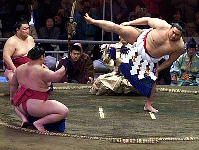
I had a quick think of what reference would be useful, and then I realised what he reminded me of - Sumos!!
http://static.userland.com/images/anand/SumoWrestlers.jpg
http://cro.zone.ne.jp/nannka/sumo.jpg
Also, for the manacles, they traditionally are clipped to ankles (and wrists), this will also reinforce the weight, by directing the eye downwards.
Another handy trick, is to apply a darker tone on the feet, or maybe a shadow on the floor.. This effectively grounds your character, which is useful to stop him from floating away.
Anyhow this is my favourite kind of concept - lotsa detail yet kept simple.. Great stuff.. Oh, and yeah, wheres his pubes eh.. Or does he trim :)
Good job on refining the arm claws - much more easily readable now.
I agree with matt about the weighting -- the leg manicles and knee area looks to be too thin to support this guys bulk - the manicles seem to cut in incredibly sharply. Trace the profile of his body (without the fur and manicles) and you'll see what I mean.
I still think the original back view is the absolute coolest - something about the pose, and clothing, and form just gives off an aura of coolness [:)]
His weighting in that view was really well balanced - the heavier bulk through the thighs down into the feet helped to balance that well ( just the feet design was very hard to get your head around).
keep it up John, it's going great!
aAAARRRRRGHahahaha (if you don't laugh, you cry) more changes! Now it has been pointed out, the knees are way too fine boned. I will redo the legs today, being the case I will see about bigger *Ahems* just for HazarD [:p] might skip the pubes, I think they will interupt the nice clean crotchline... errr did I just say that? At some stage I will do the back view in a Marker technique for the folio too- in some ways it is more interesting than the front!
Matias: this is my first project with markers, I did the character 3 time, twice at A4 and once at A5. I photocopied the pen drawing several times so there was no pressure of ruining an original.
Stay tuned for my next creature concept, I think i have refined the technique a little further- Just gotta change a leg on that one too before i post.
------------------------------------
Okay changes made... hopefully the last for this one!
I love the work you've done so far JohnN. [:D]
A few comments:
1. Love the spikes up the outer arms, very nice touch.
2. The feet are much better than the original sketch. I'd make his feet a little bigger though (unless it's just because of the perspective of the picture), to fit the proportion of the body.
3. More hair. I could see this ugly fellow with hair on his belly, upper chest and thighs. I think that would bring out the nastiness alittle more. It's my opinion, so you don't have to listen to me [:)]
Overall, very cool. Love the axe too. [:p]
sweet, JohnN! my only niggle would be with his feet, of course I'm not sure what ogre feet look like so I'm not sure what sort of effect your going for, maybe if the rear pic had his foot drawn it would cement the idea your portraying. Crazy-sweet axe! sorry I cant give you an industry POV. [:(]