Hey Guys !
Please comment on my work it really helps me to progress. Also keep in mind it's my first building so I have a lot of room to grow and experiment.
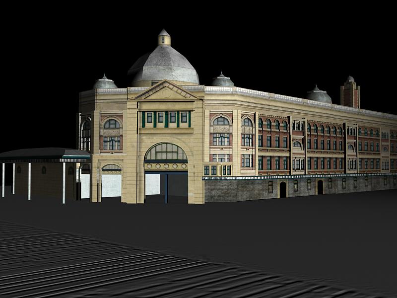
First of all it looks too flat and angular making it look fake. Some better lighting would cover up the mistakes, like a second light pointing at the back. I'm guessing you used the default lighting. You should look up some 'three-point lighting' tutorials.
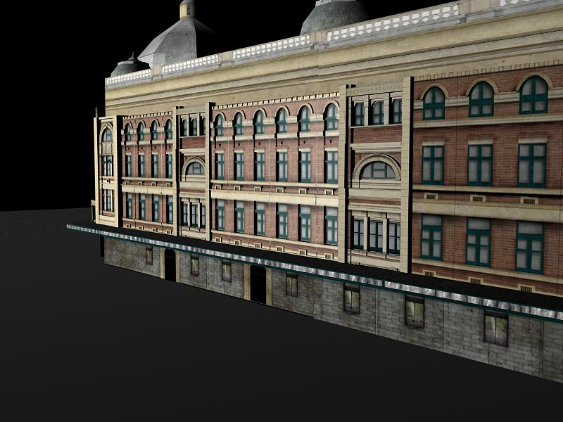
The textures are ok, you can work on some bump maps for extra details in the windows, or even add extra polygons.
I agree with the need for better lighting - I think your lighting is a bit too harsh (especially seen in your previous journal entry which has some really dark jagged shadows), and you definitely need more than one directional light in there. That should help soften the shading in the dome up the top too.
My other critique, which I was planning to write even before seeing Ahmed's journal post:
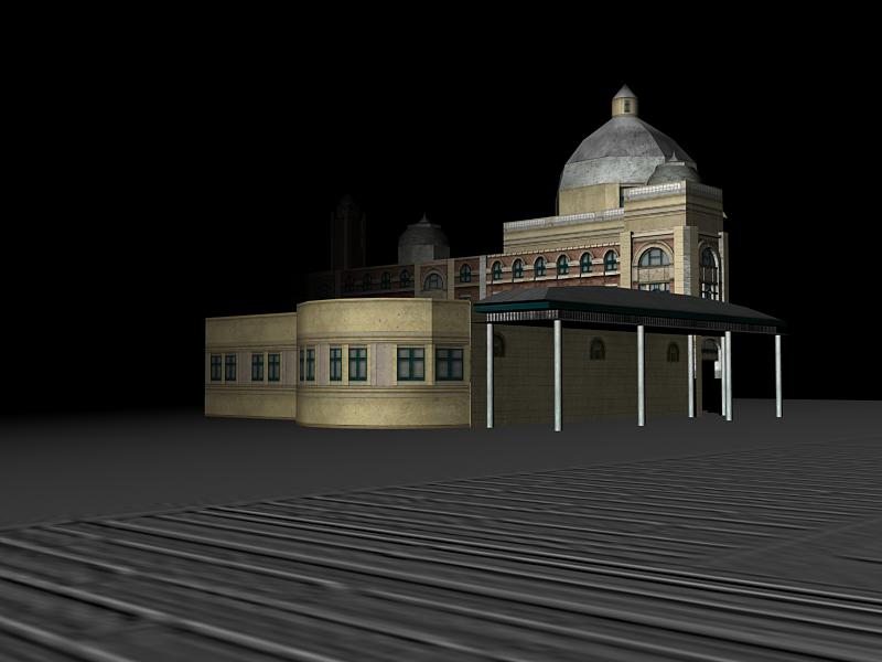
If this is your final render, you need to present it much more nicely, especially if it's going to go into your portfolio! Put some roads, sky, street signs, a car or two in there. Light it up nicely and make it pretty :) I love what ahmed's done in that picture, and that should be an example on how to present work.
Thanks so much for your critiques !
It's great that you've both taken the time to give me some ideas and I will defiantly look up a few tuts and expand on the image .My current teacher also suggested the same thing.
Critique
Hey, this is a good first attempt.
First of all it looks too flat and angular making it look fake. Some better lighting would cover up the mistakes, like a second light pointing at the back. I'm guessing you used the default lighting. You should look up some 'three-point lighting' tutorials.
The textures are ok, you can work on some bump maps for extra details in the windows, or even add extra polygons.
Hope this helps :)
~Skyla
Presentation
I agree with the need for better lighting - I think your lighting is a bit too harsh (especially seen in your previous journal entry which has some really dark jagged shadows), and you definitely need more than one directional light in there. That should help soften the shading in the dome up the top too.
My other critique, which I was planning to write even before seeing Ahmed's journal post:
http://www.tsumea.com/journal/ahmedrostom/181008/old-house
If this is your final render, you need to present it much more nicely, especially if it's going to go into your portfolio! Put some roads, sky, street signs, a car or two in there. Light it up nicely and make it pretty :) I love what ahmed's done in that picture, and that should be an example on how to present work.
Thanks so much for your
Thanks so much for your critiques !
It's great that you've both taken the time to give me some ideas and I will defiantly look up a few tuts and expand on the image .My current teacher also suggested the same thing.
Thank you so much.
Mel.