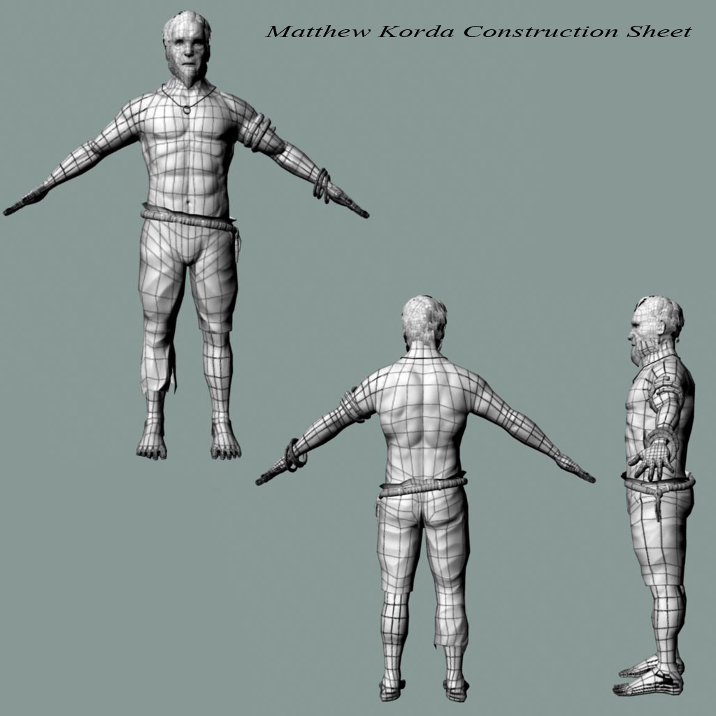
3D Artist

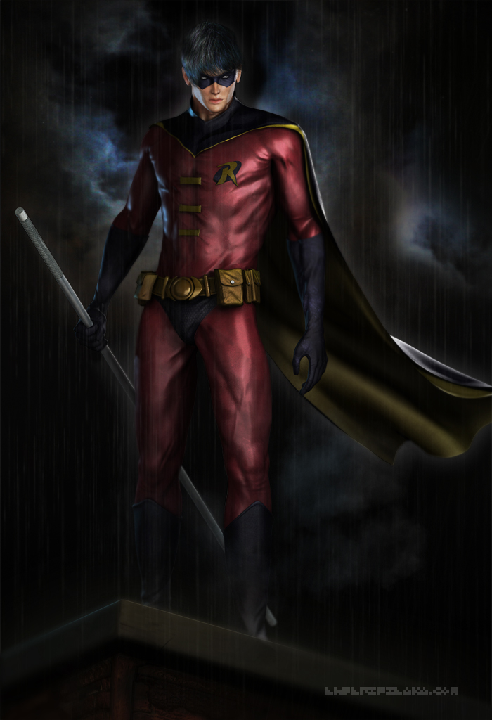
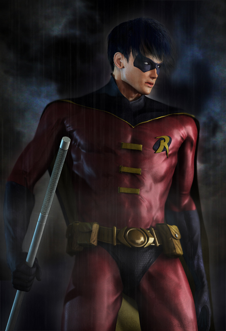
Tim Drake - Robin
Journal Category

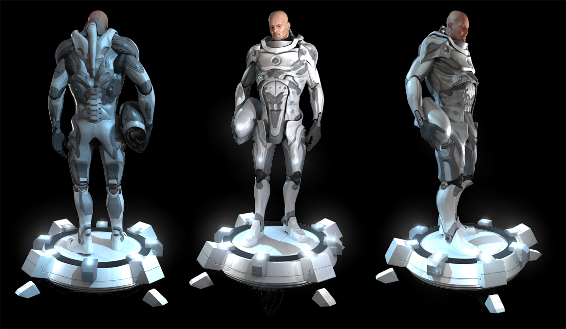
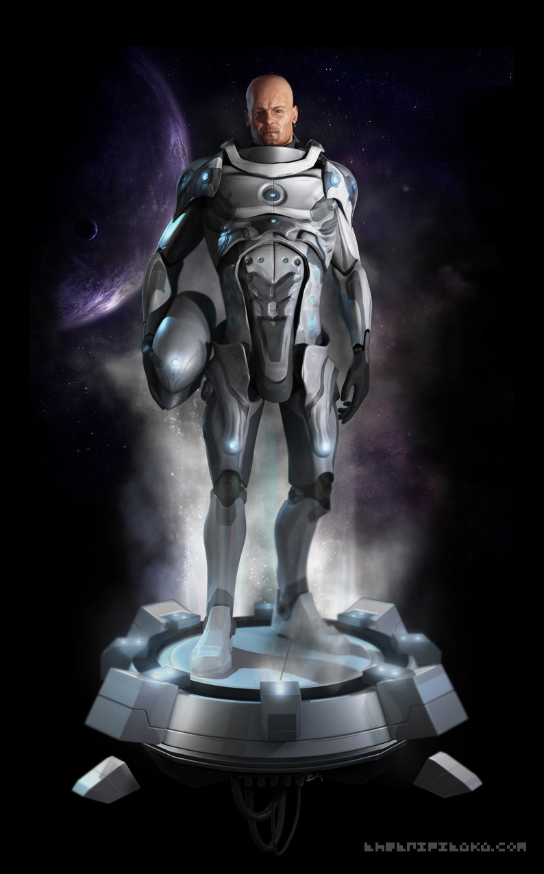
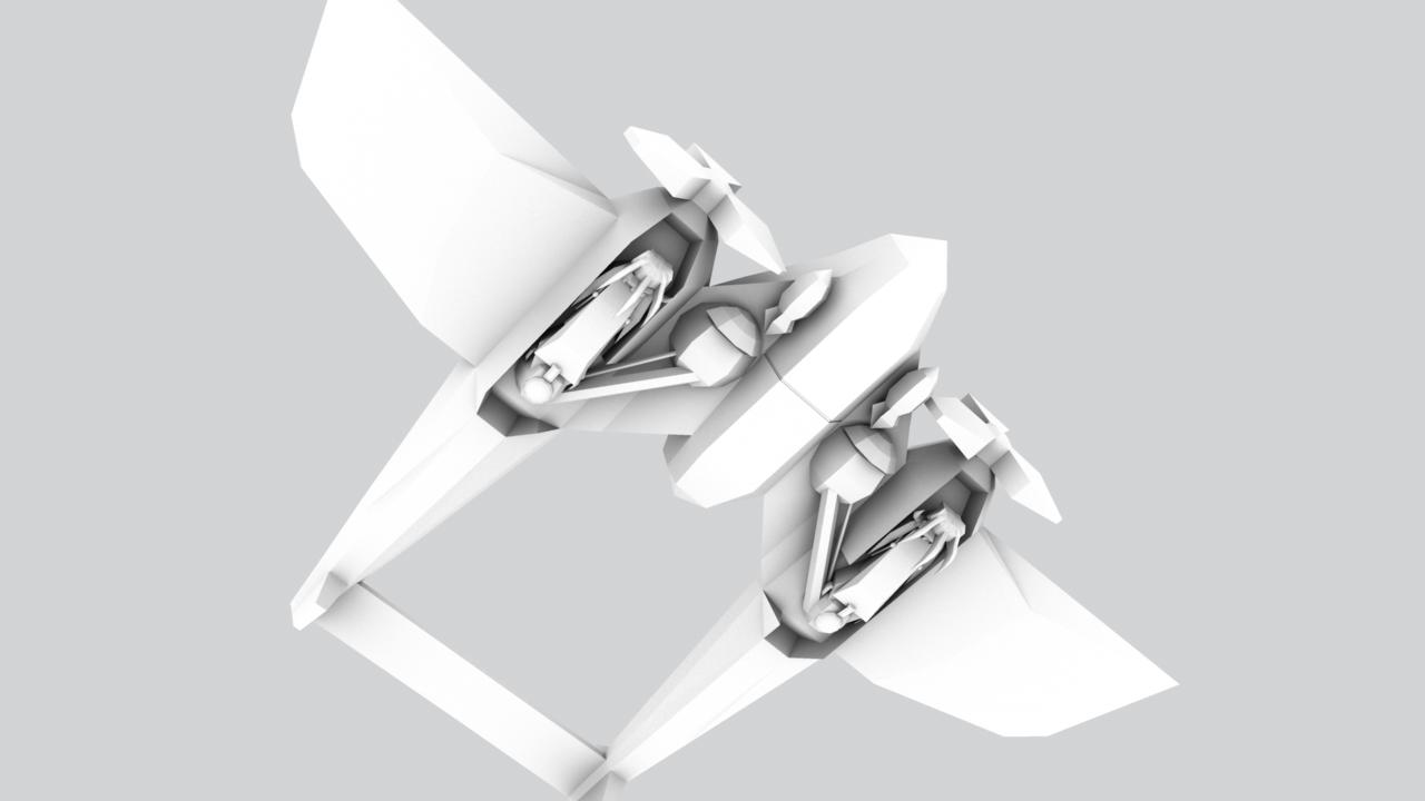
Space Jumper
Journal Category
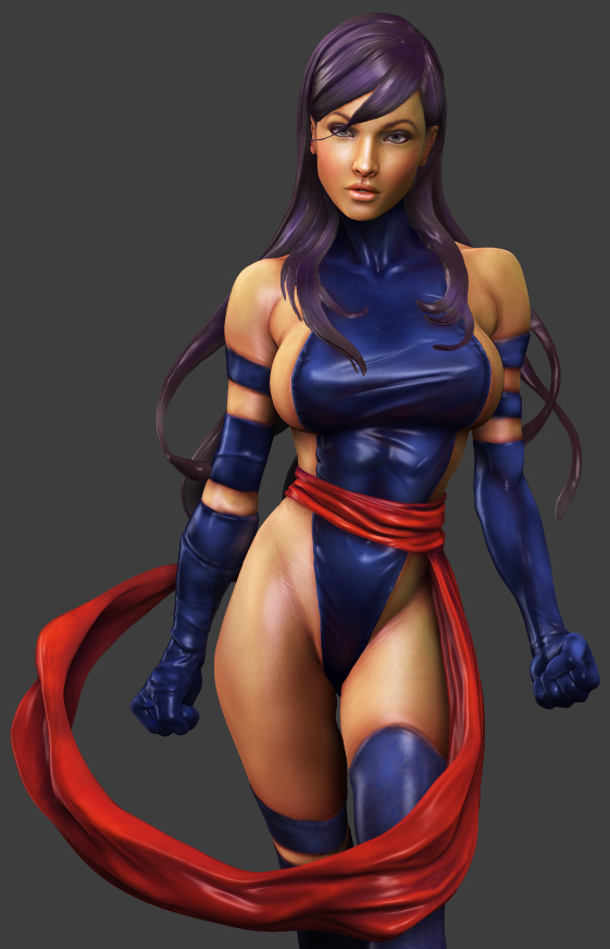
Psylocke sketch
Journal Category
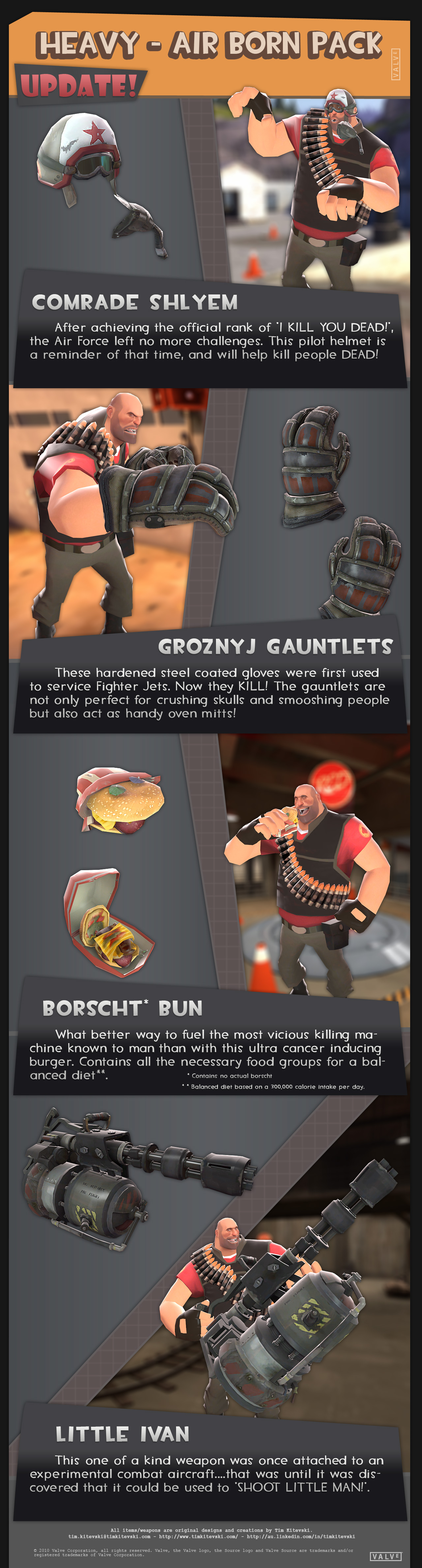
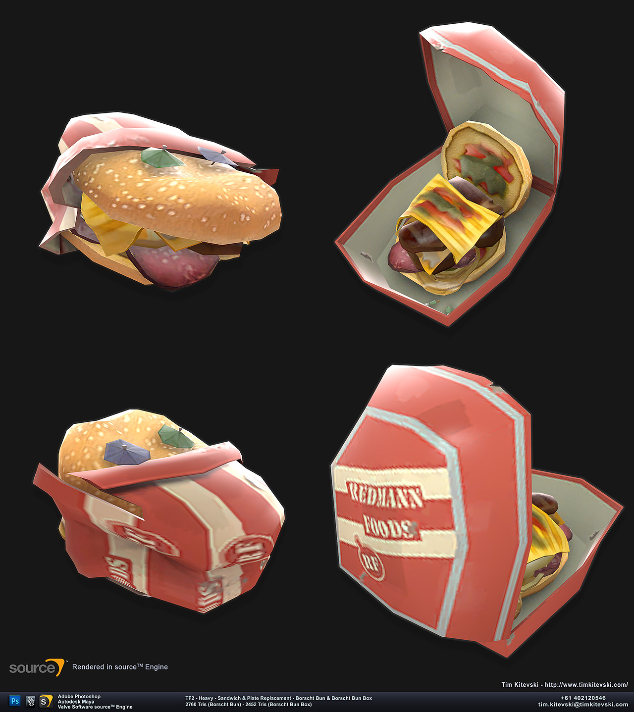
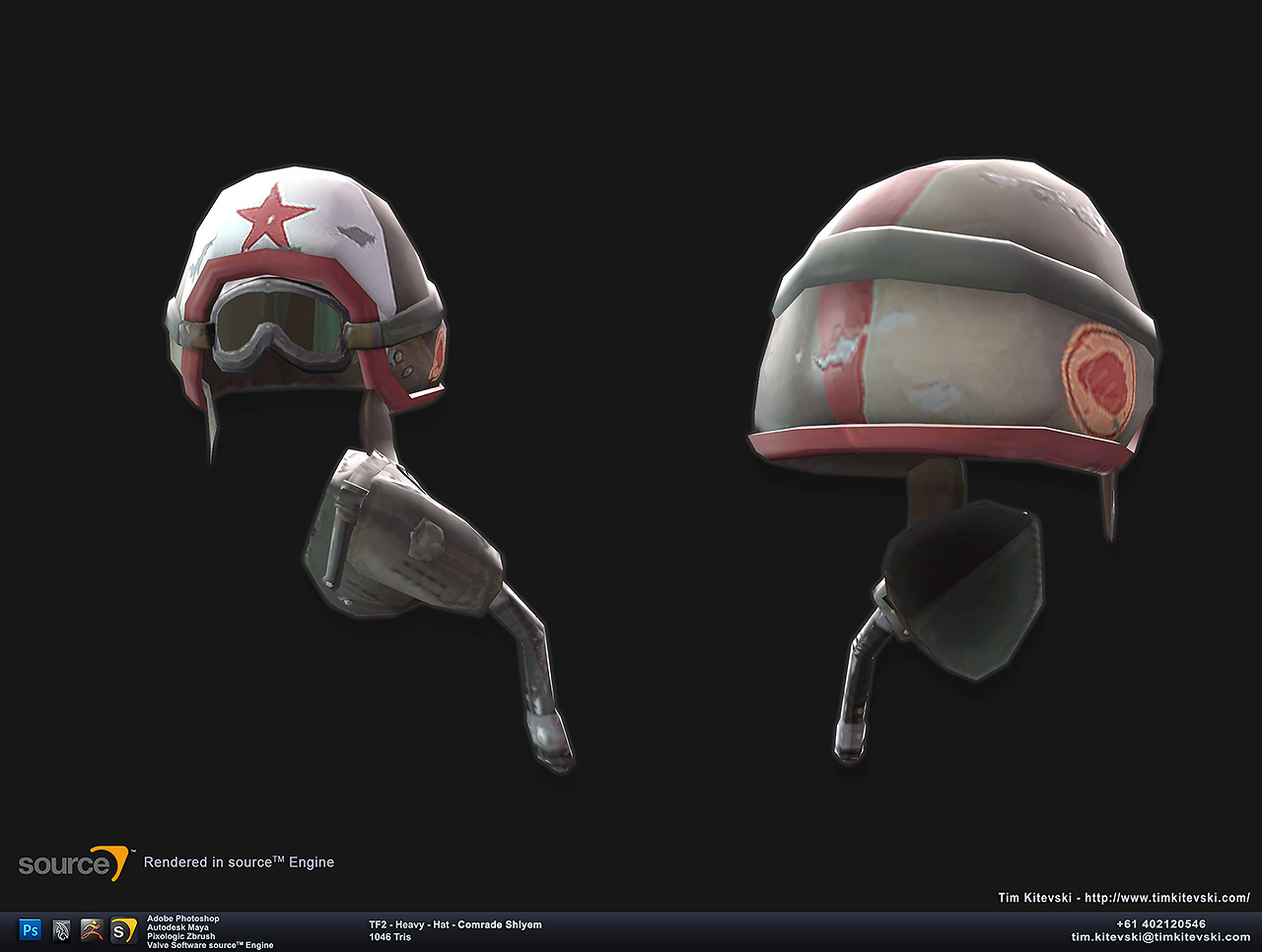
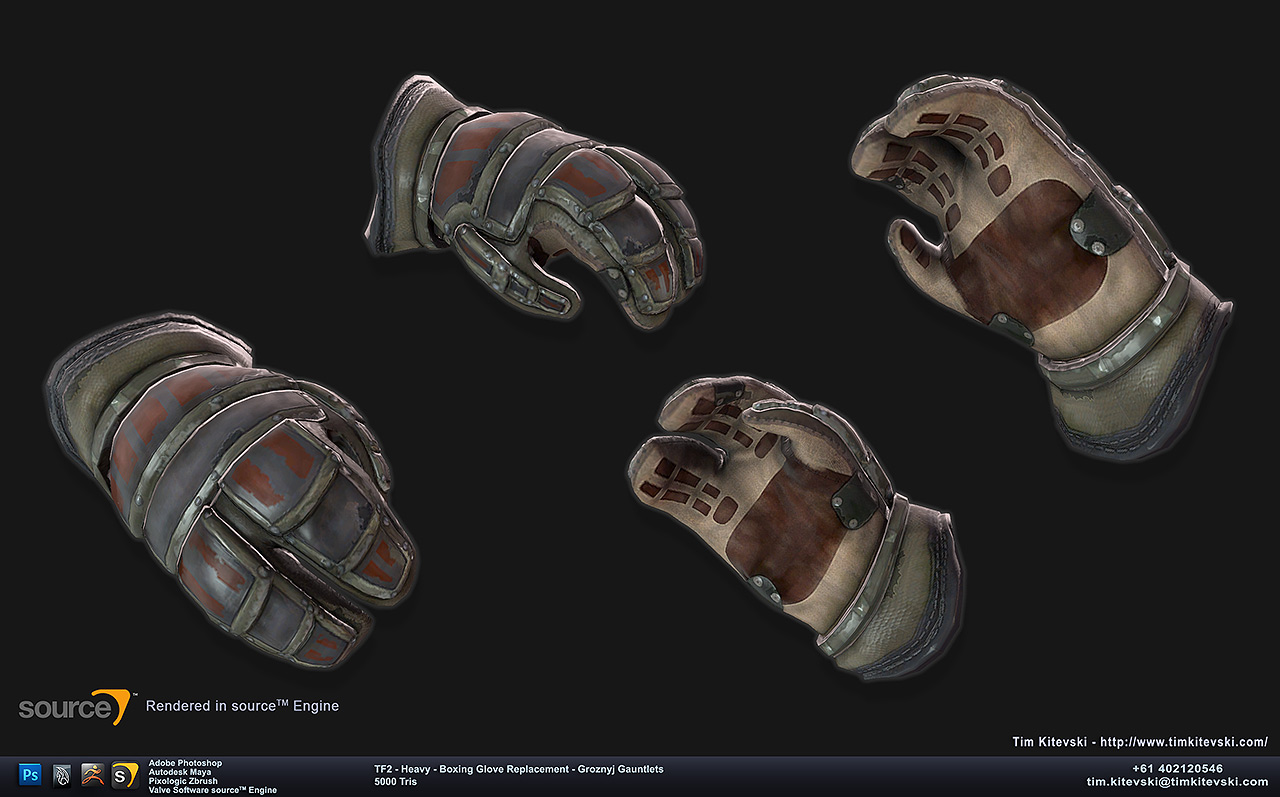
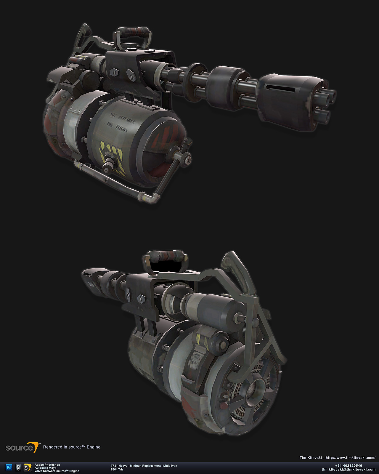
TF2 Custom Item Pack - Air Born
Journal Category

Concept - Bird of Prey
Journal Category
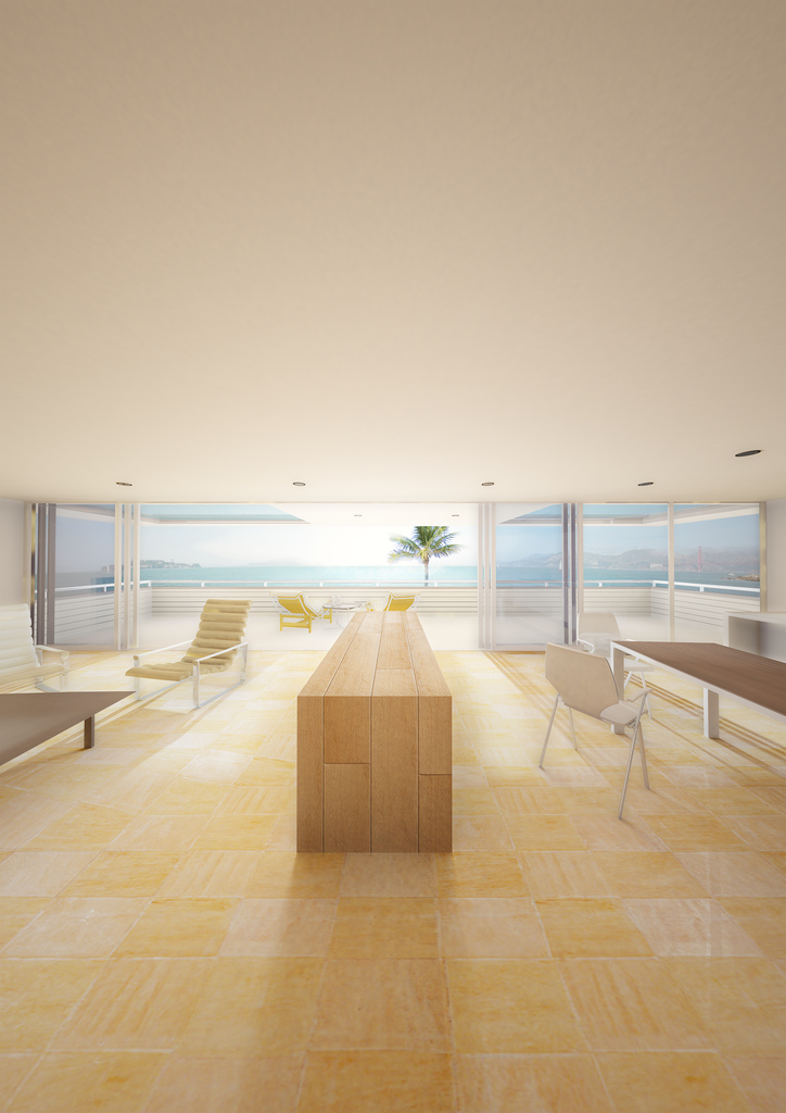
Architectural Visualisation - Palm Beach House
Journal Category

Liah the Cute Teenage Witch
Journal Category


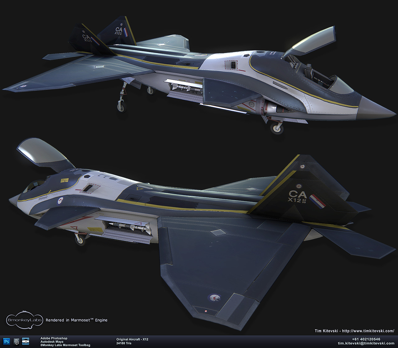
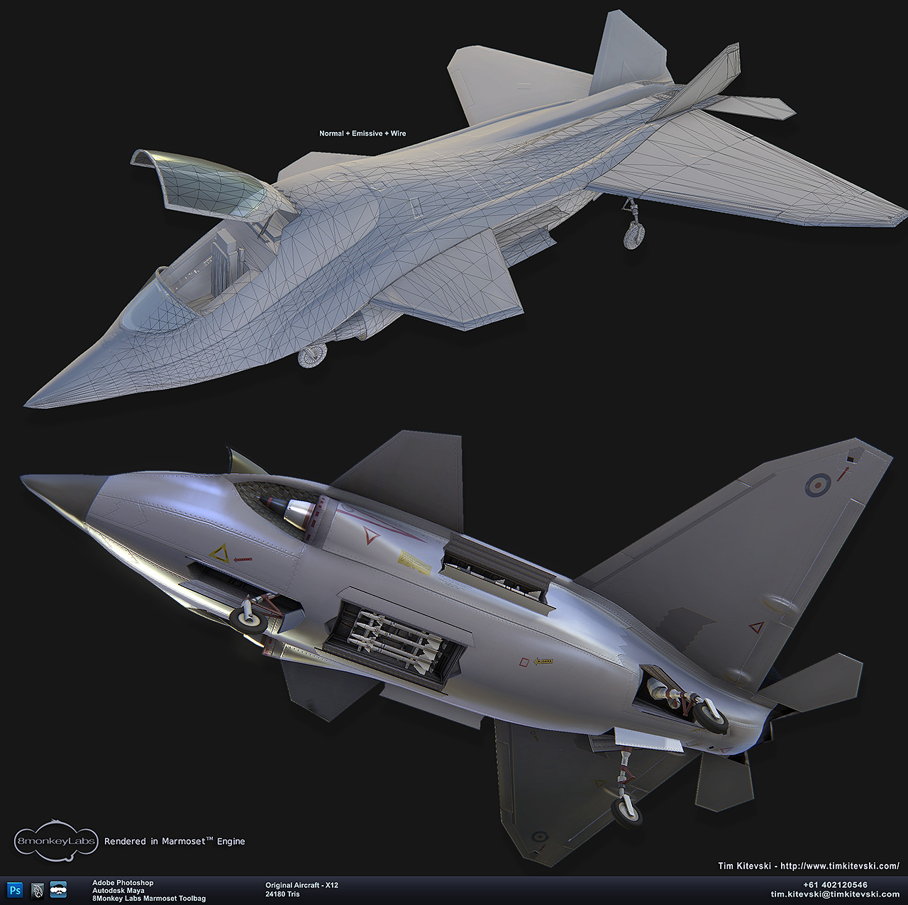
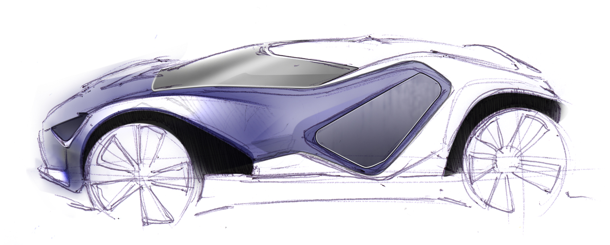
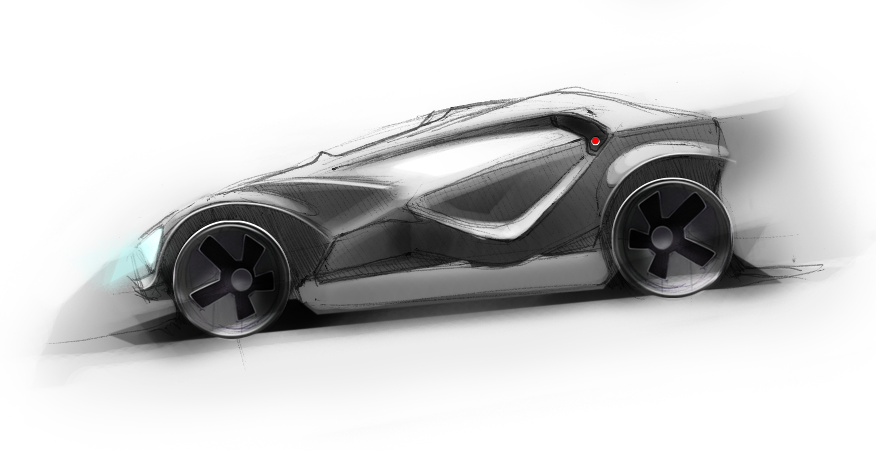
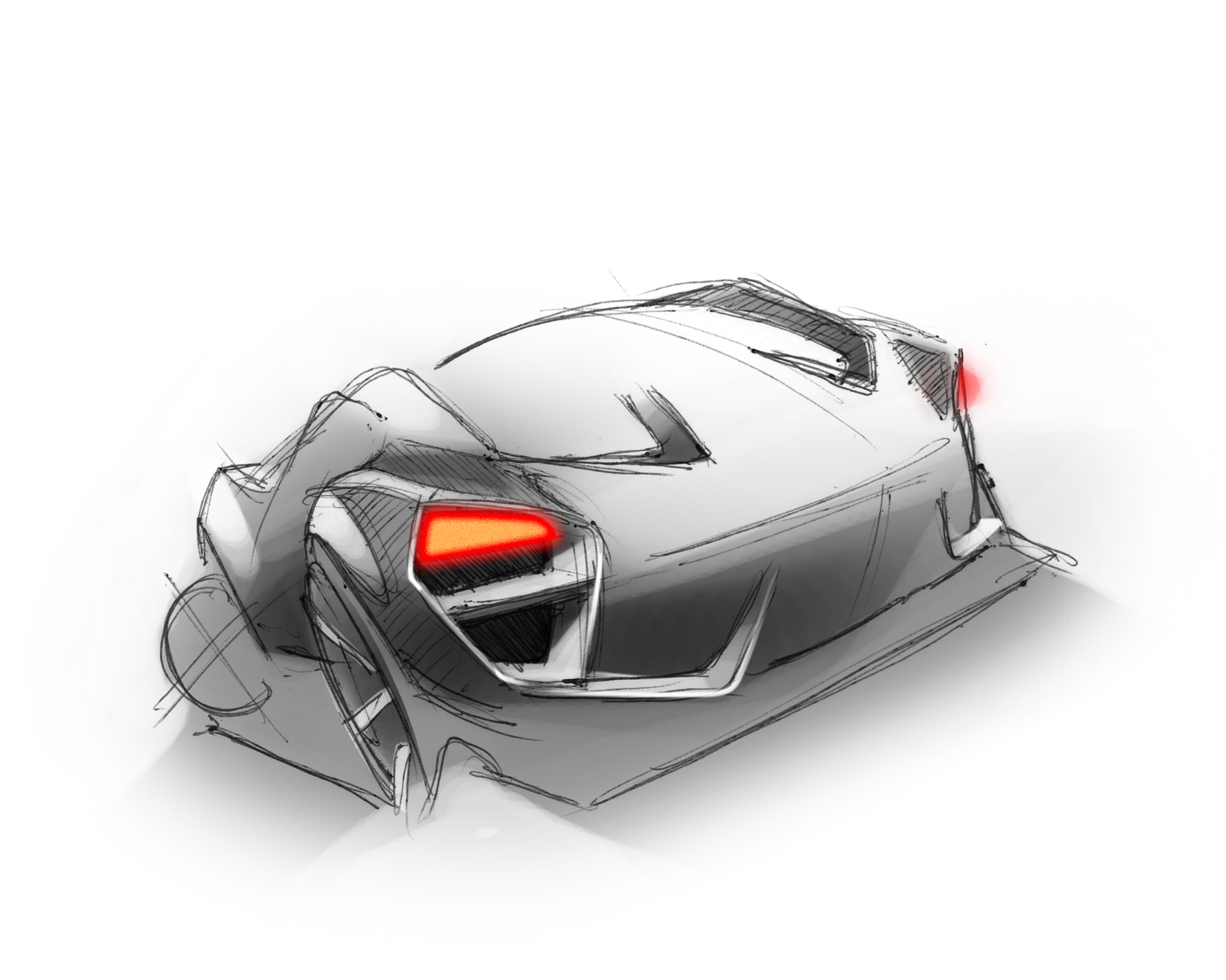
Original Aircraft Design
Journal Category
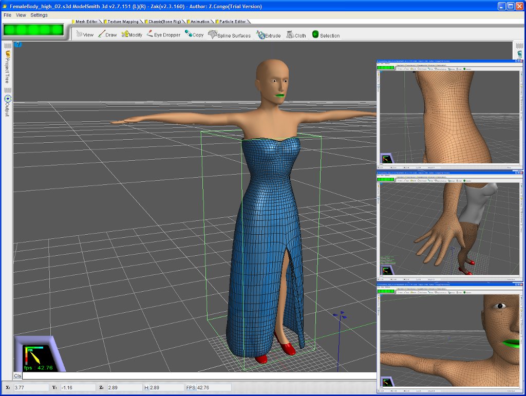
ModelSmith3d Beta - Volunteers Wanted
Journal Category
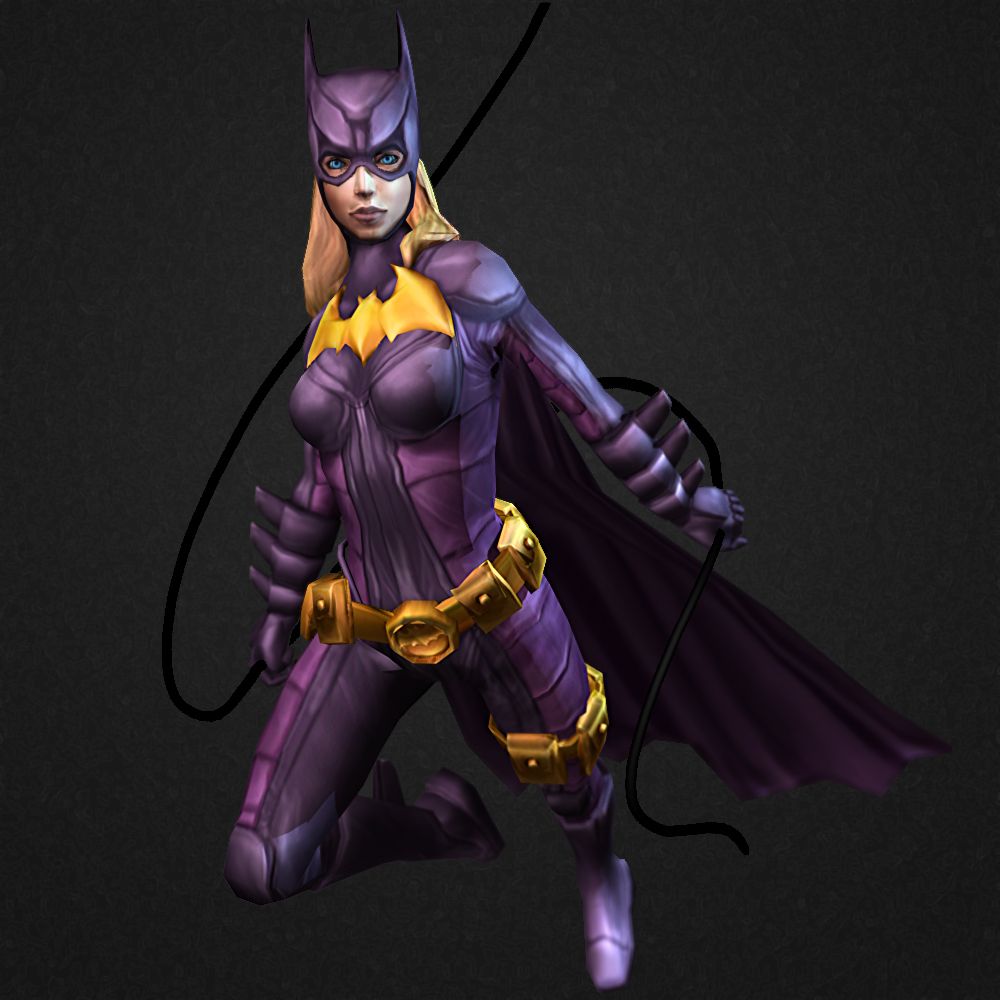
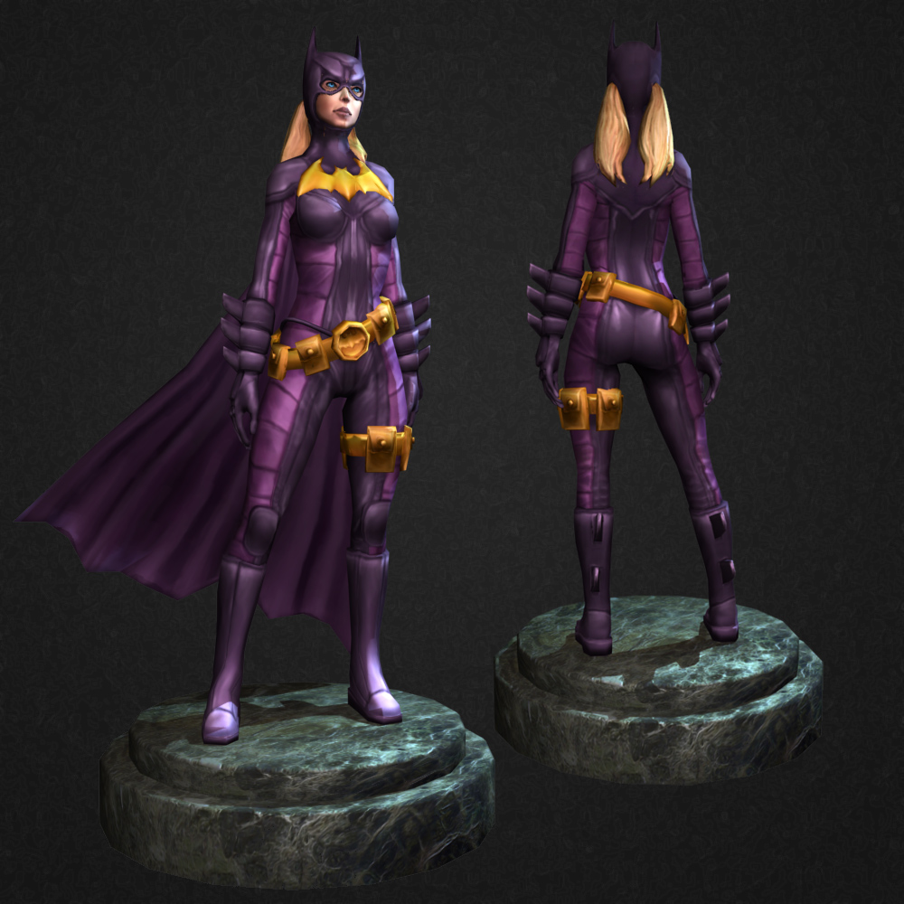
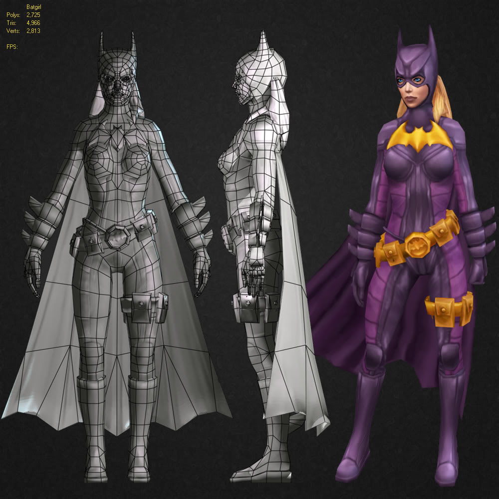
Batgirl - Comicon
Journal Category
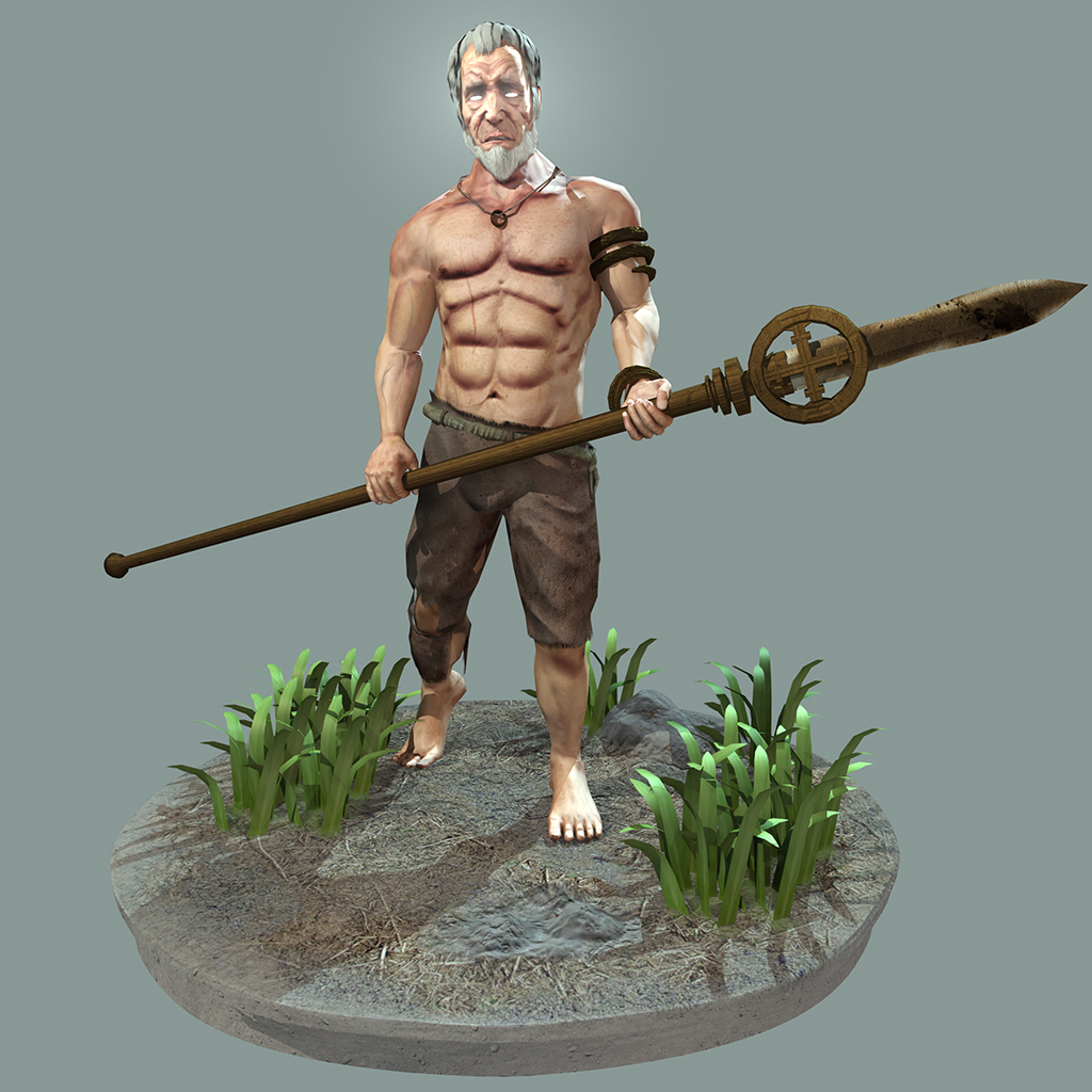
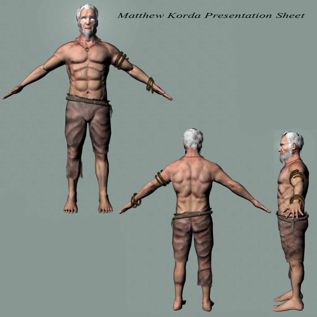


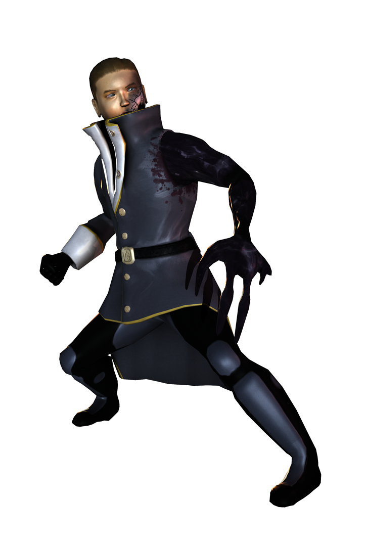
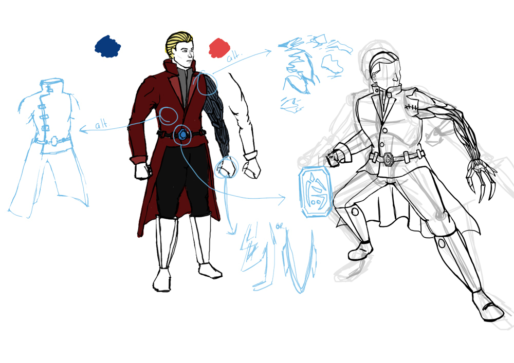
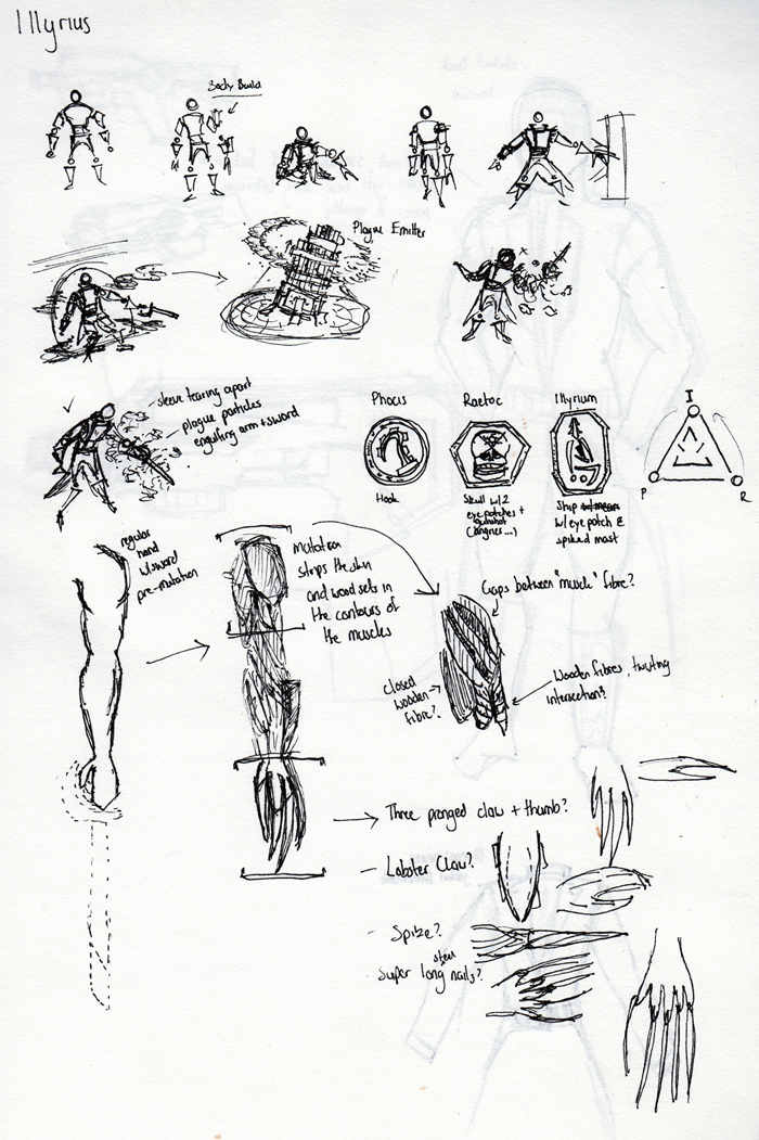
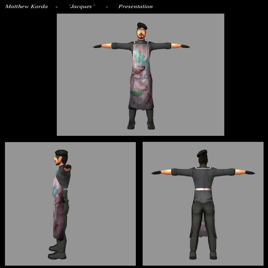
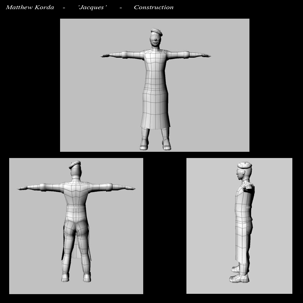
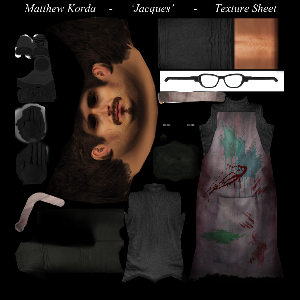
Jacques the serial killer artiste
Journal Category

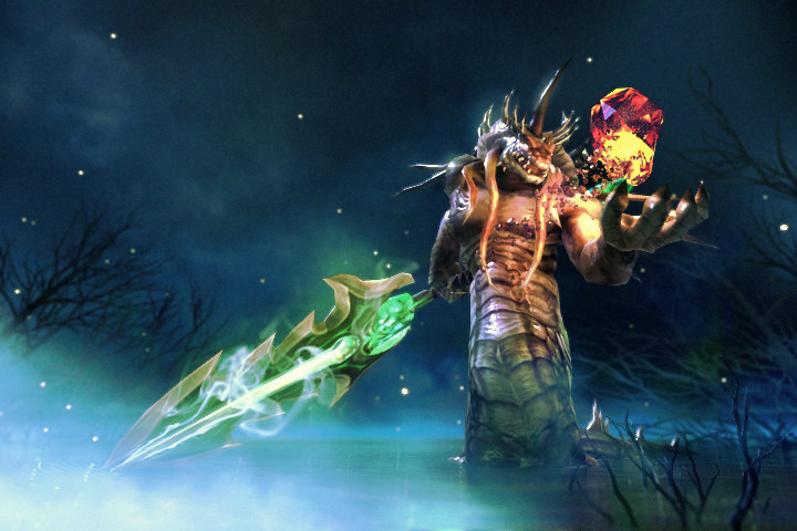
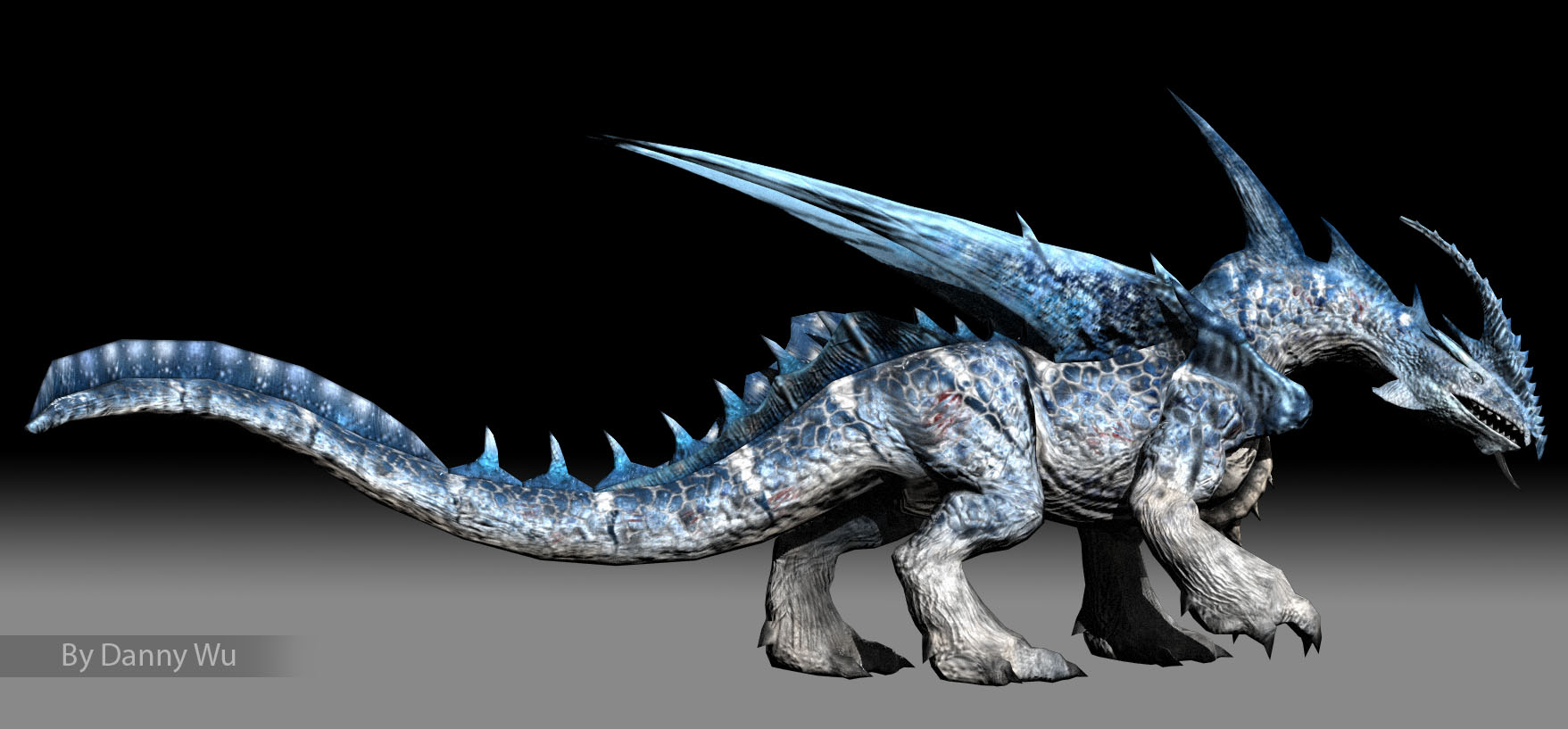
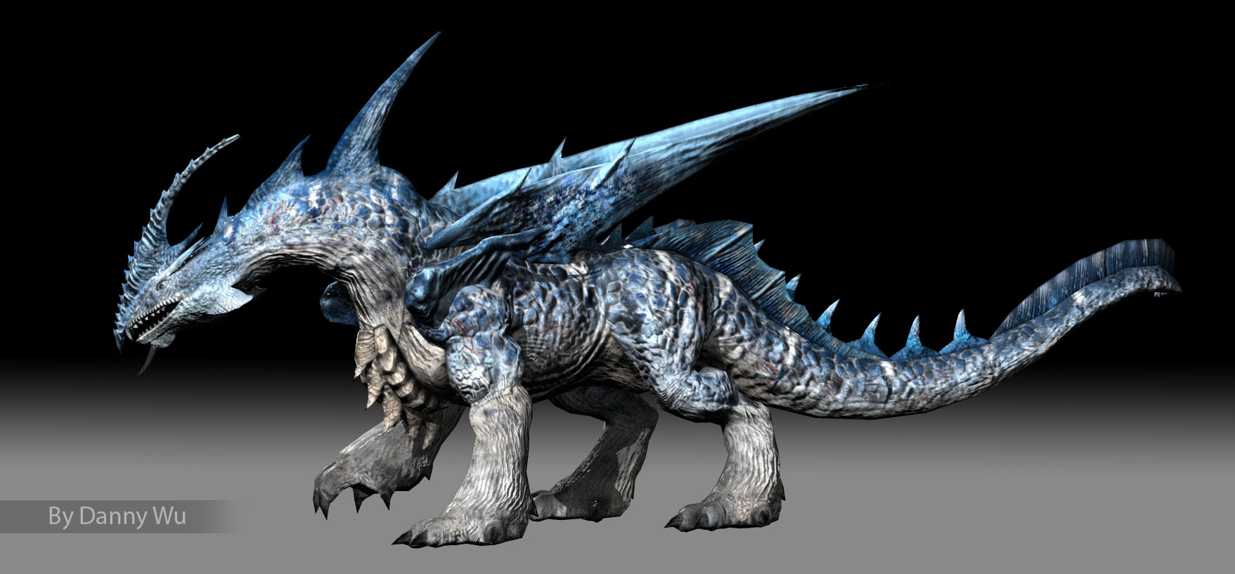
Ice Dragon
Journal Category
Empress of Justice
Journal Category
GA Mini OZ
Journal Category
The Pope Charatcer design and 3d model
Journal Category
My folio for concept and 3D work, Its a 5mb flip folio
Journal Category