2D Artist
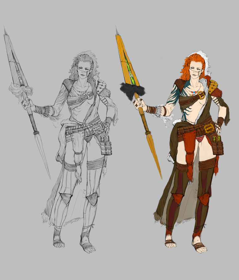
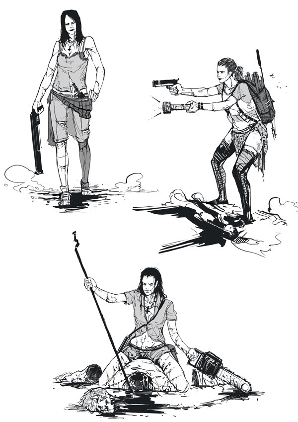
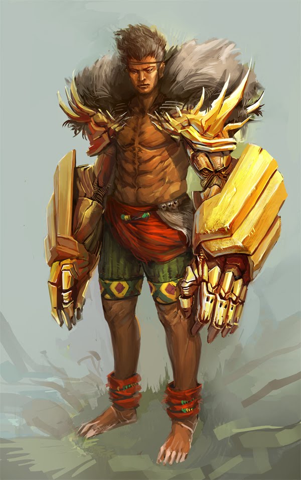
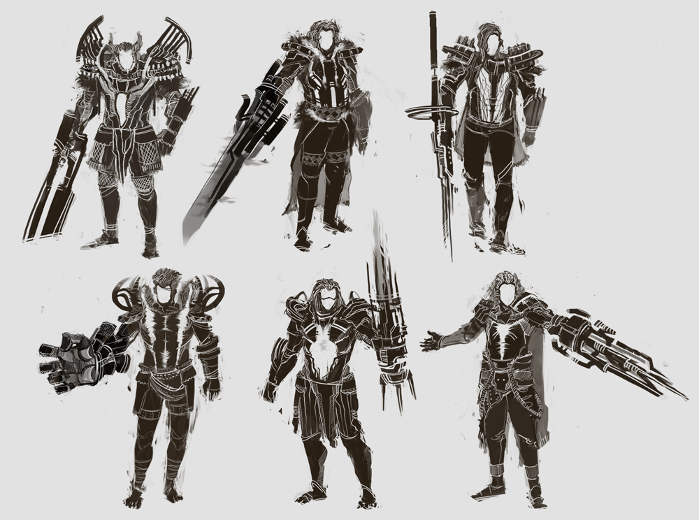
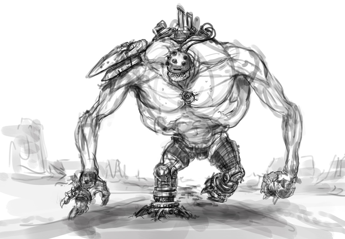
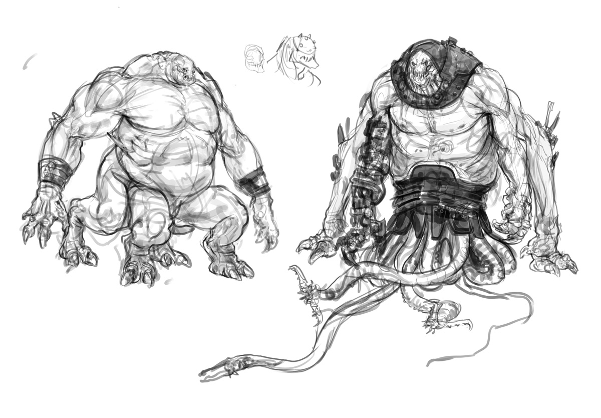
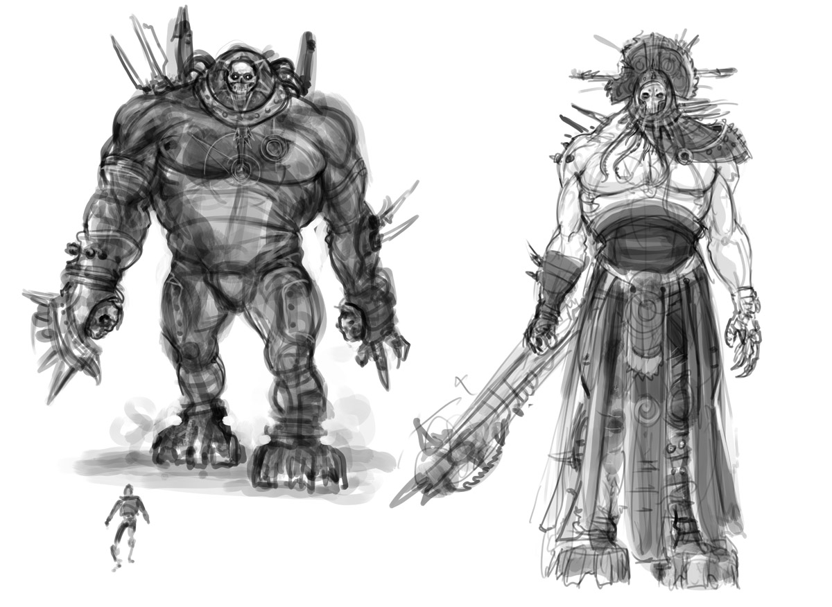
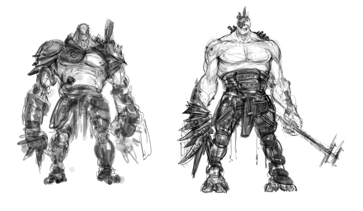
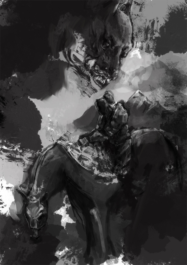
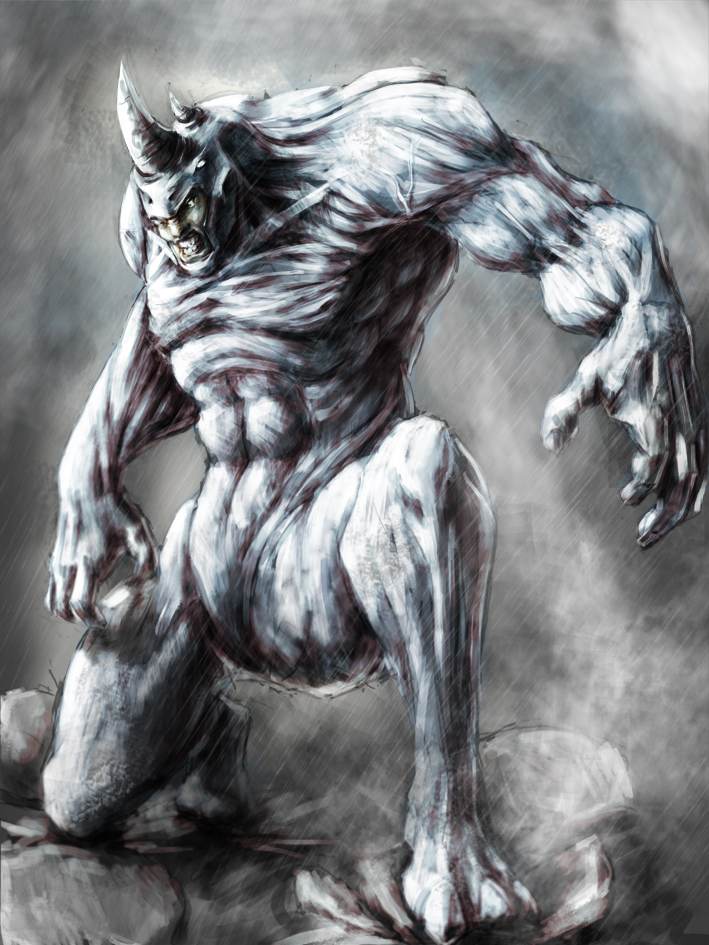
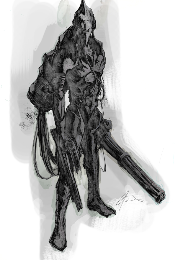
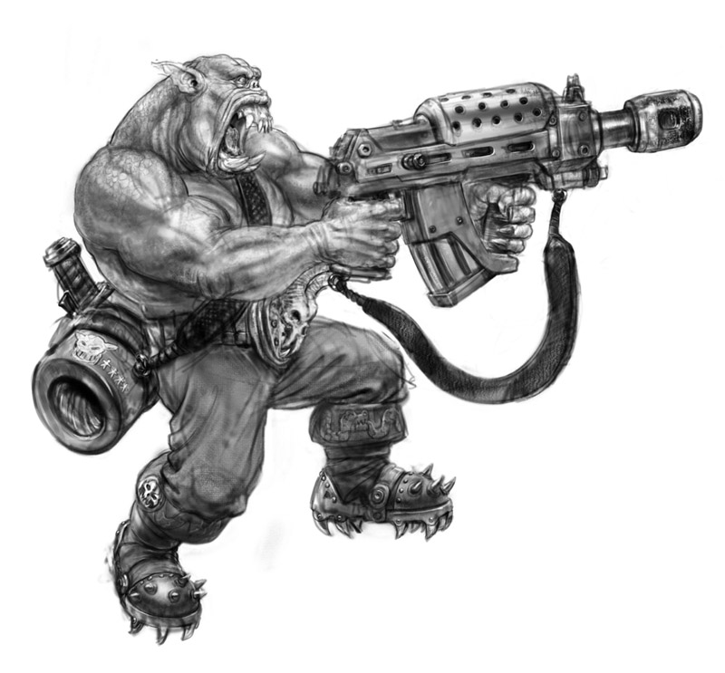
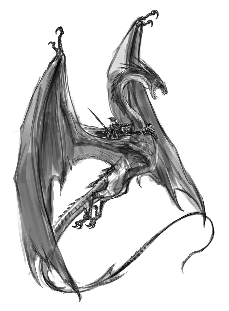
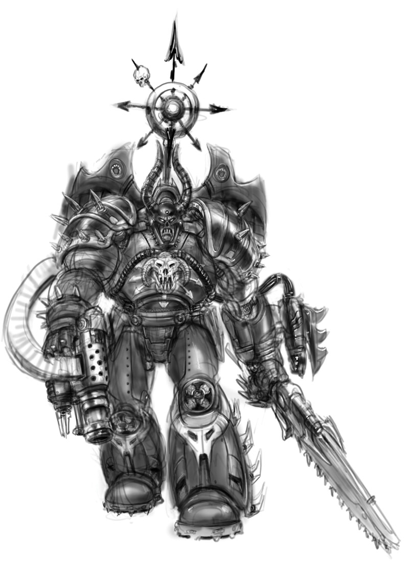
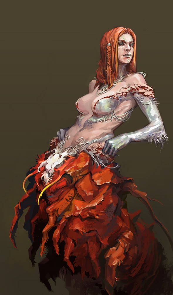
Some rough ideas for bad guys
Journal Category
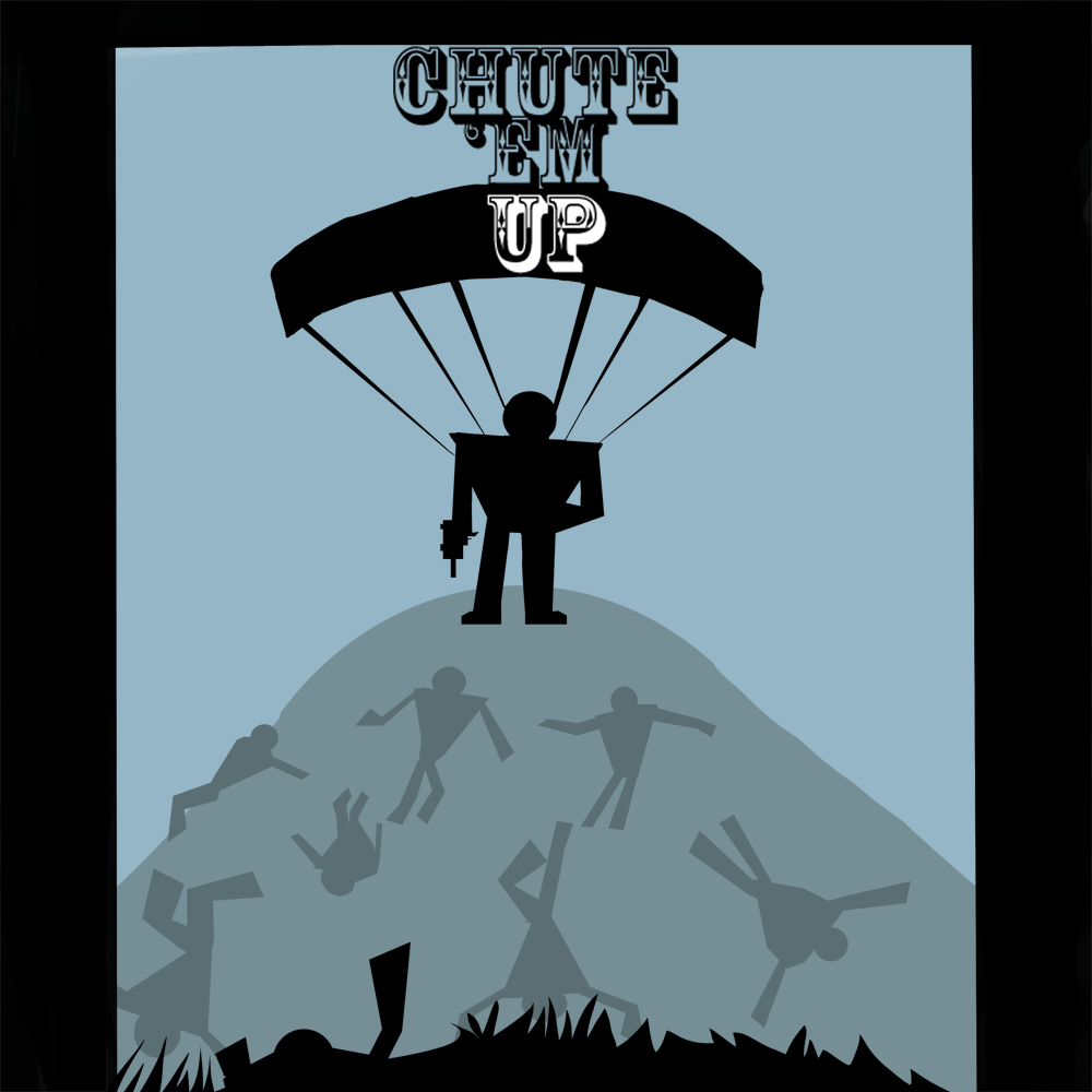
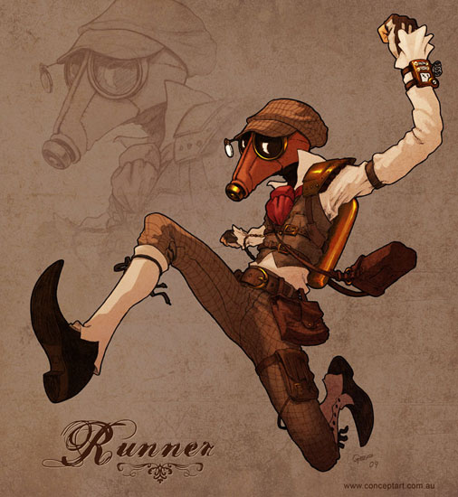
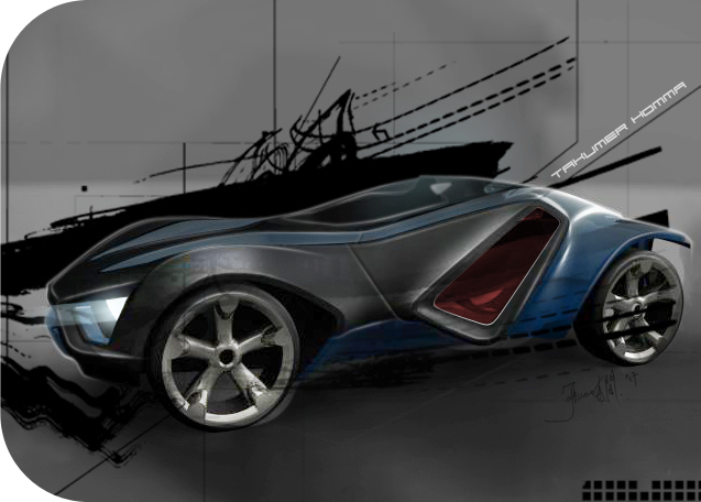
Chute 'Em Up
Journal Category


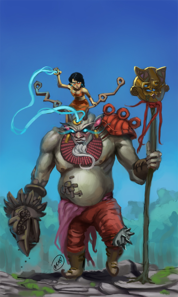
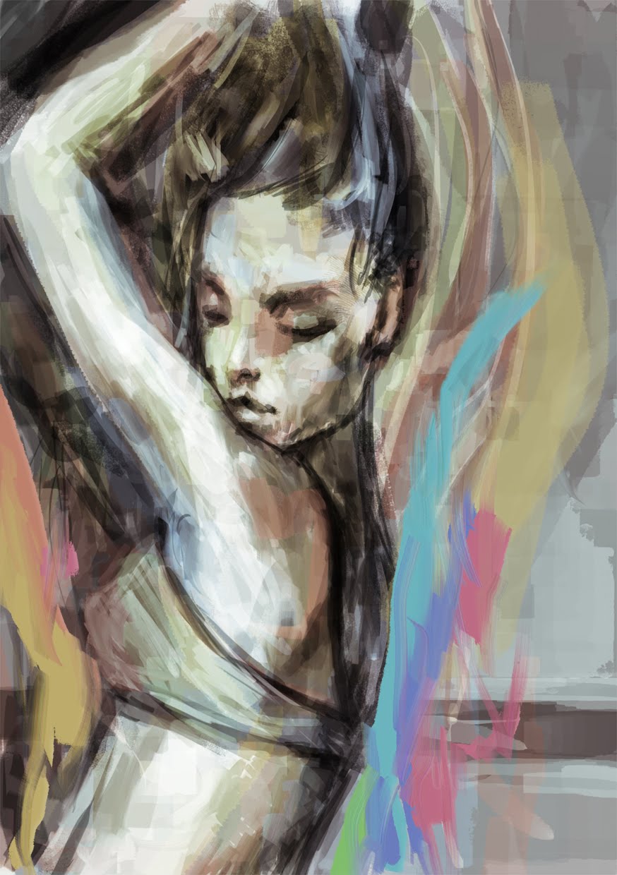
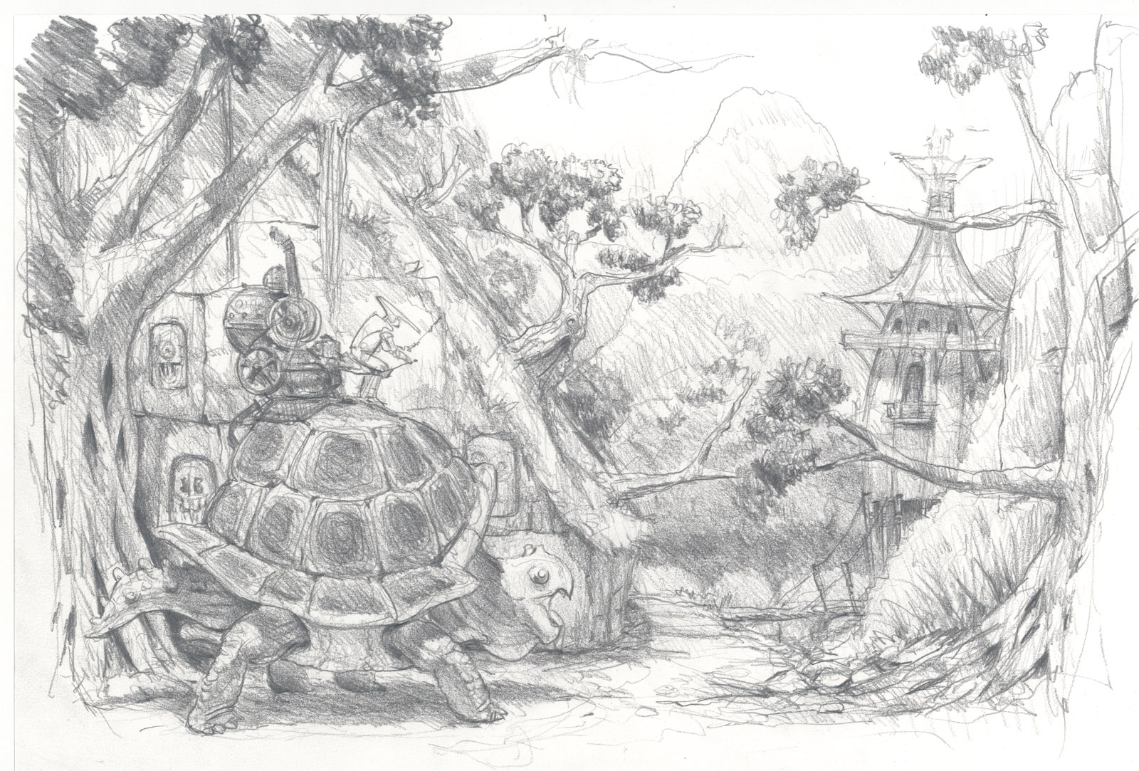
tripitaka art
Journal Category


Balloons and Sugar
Journal Category
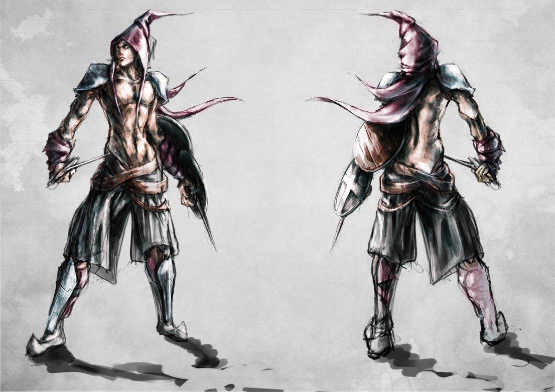
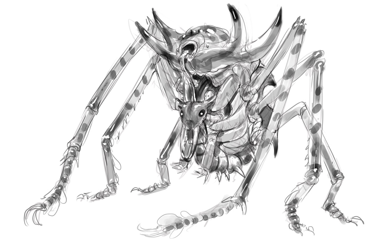
Recent Chow- Insect Armour
Journal Category
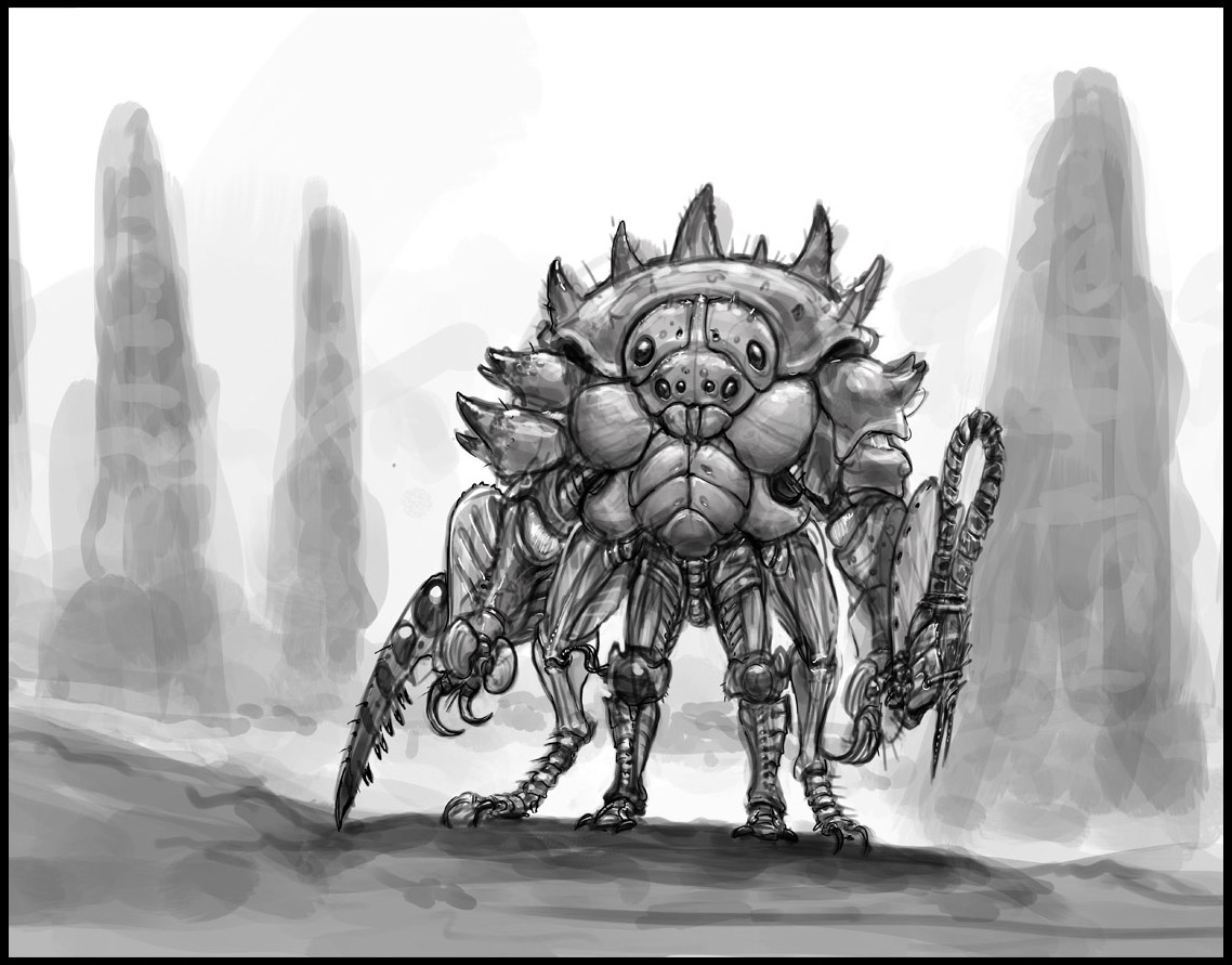
Recent Chow- Insect Armour
Journal Category
Some Art prints from Aussiecon4
Journal Category
Couple of drawings from AussieCon4
Journal Category
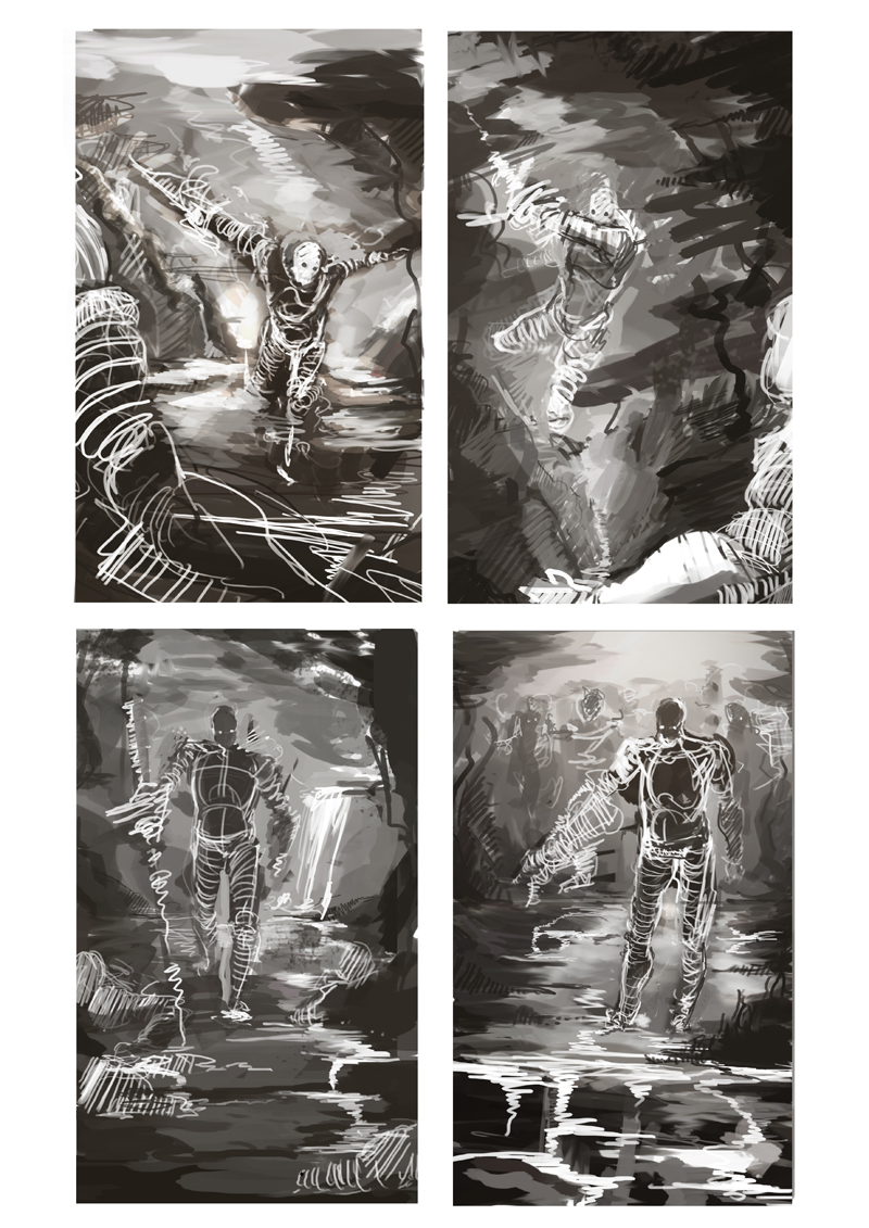
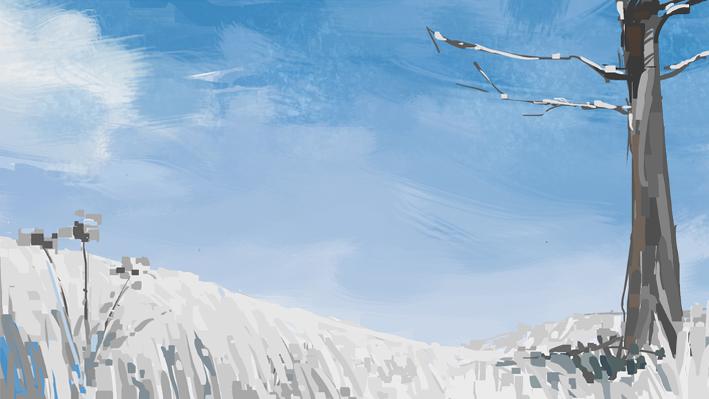
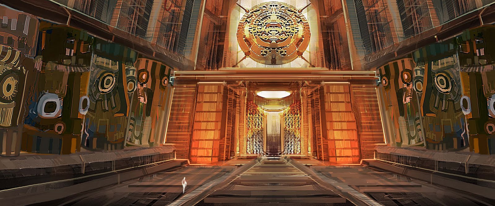
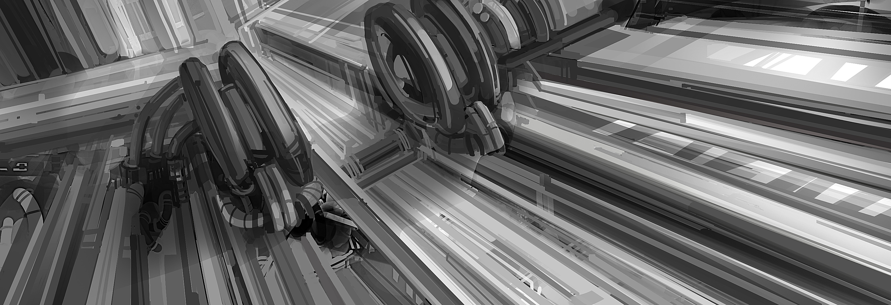
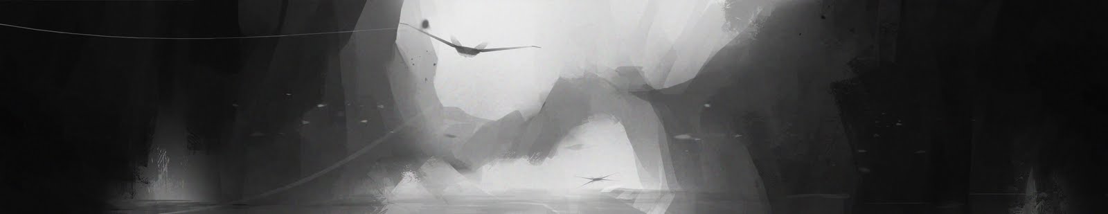
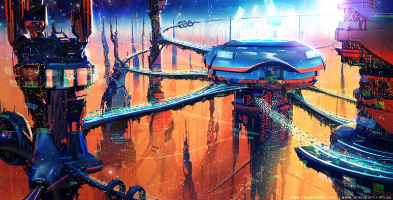
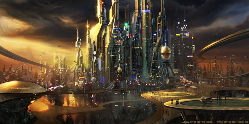
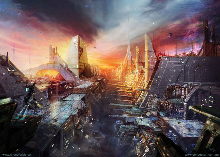
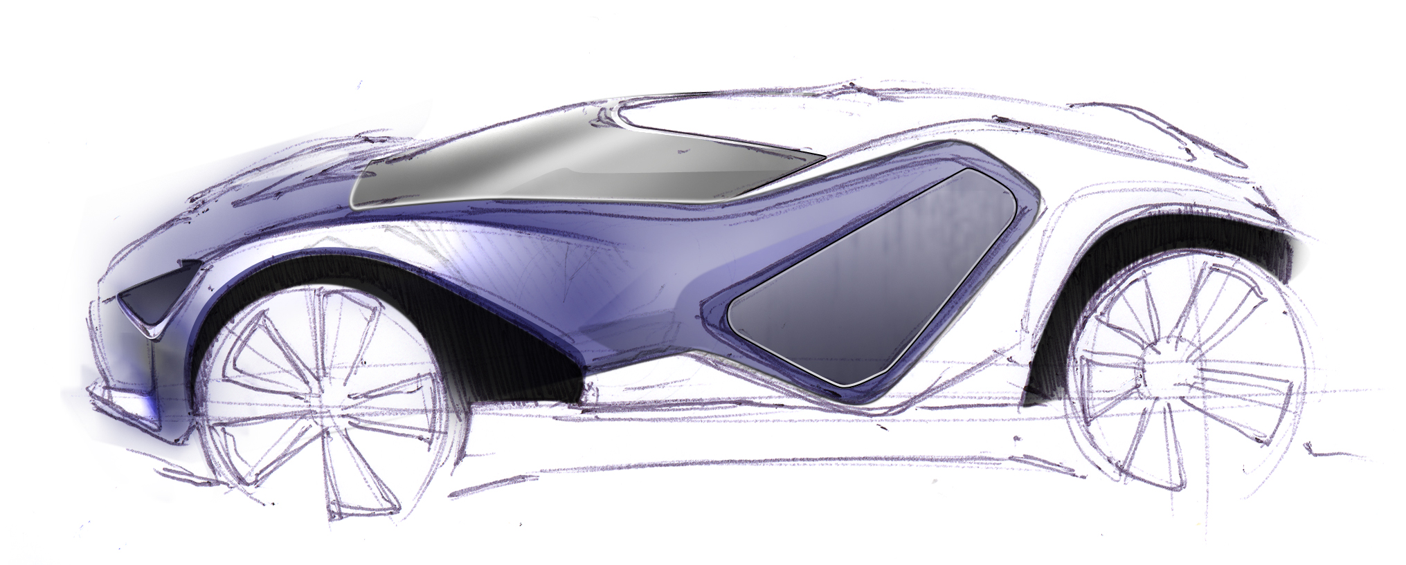
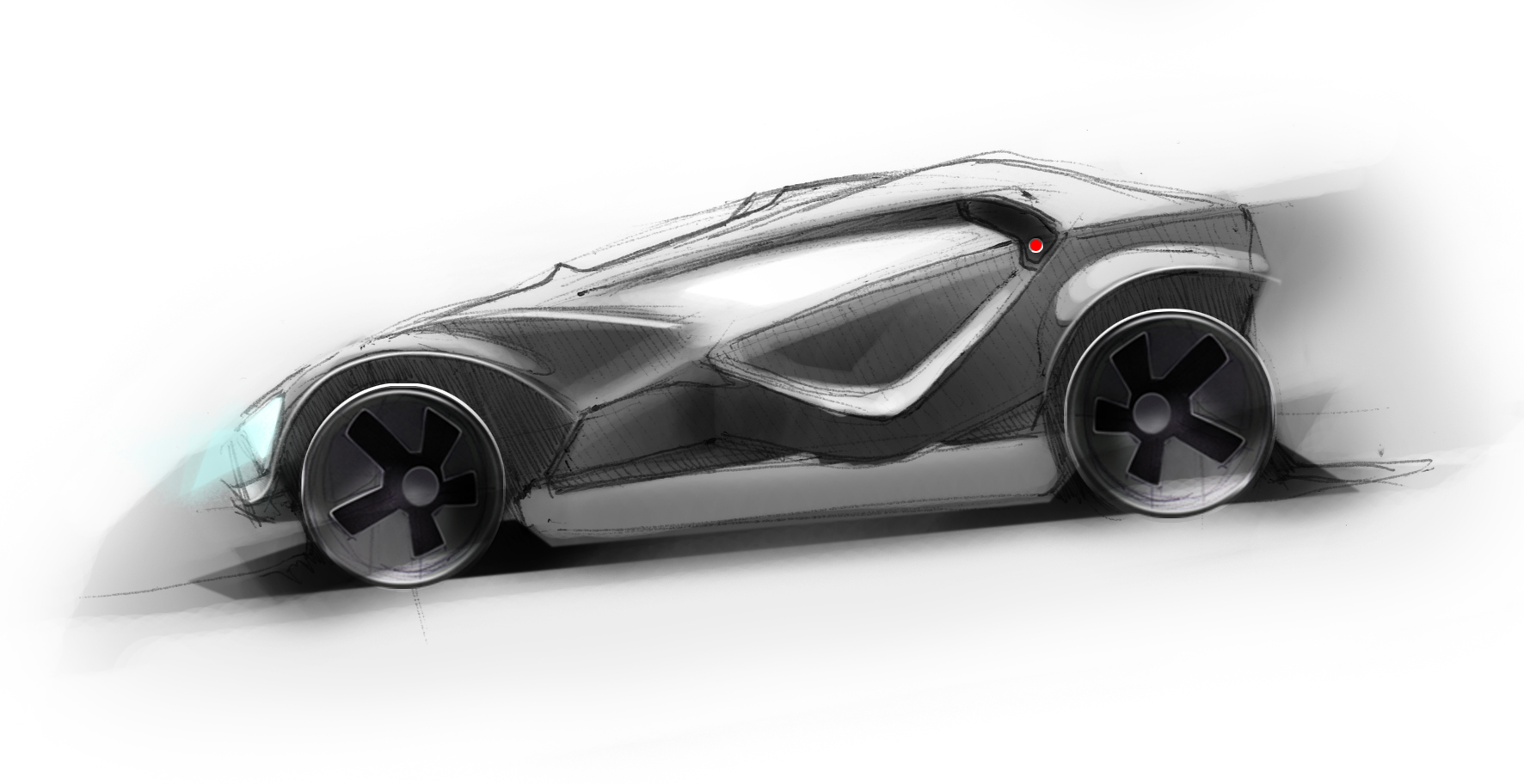
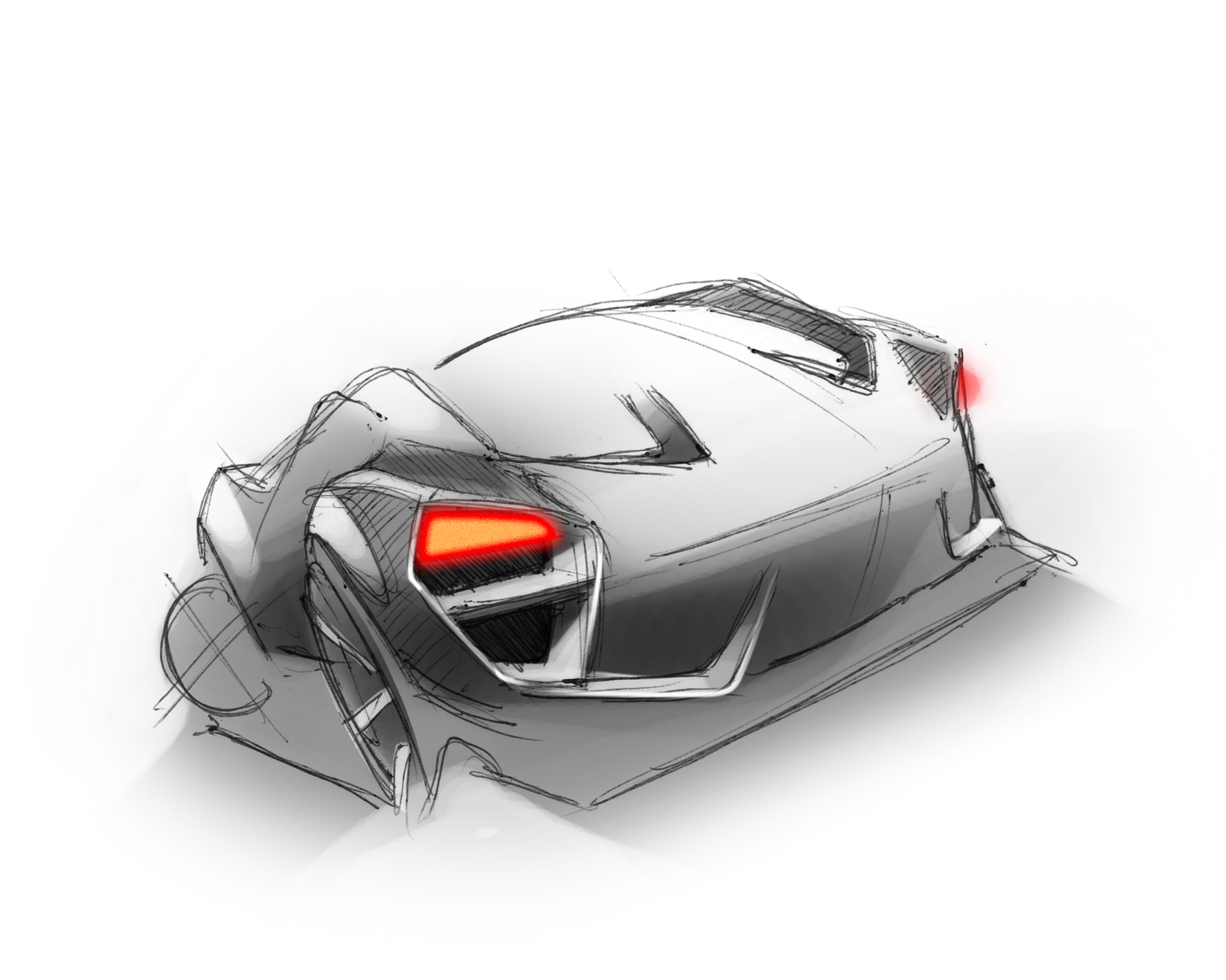
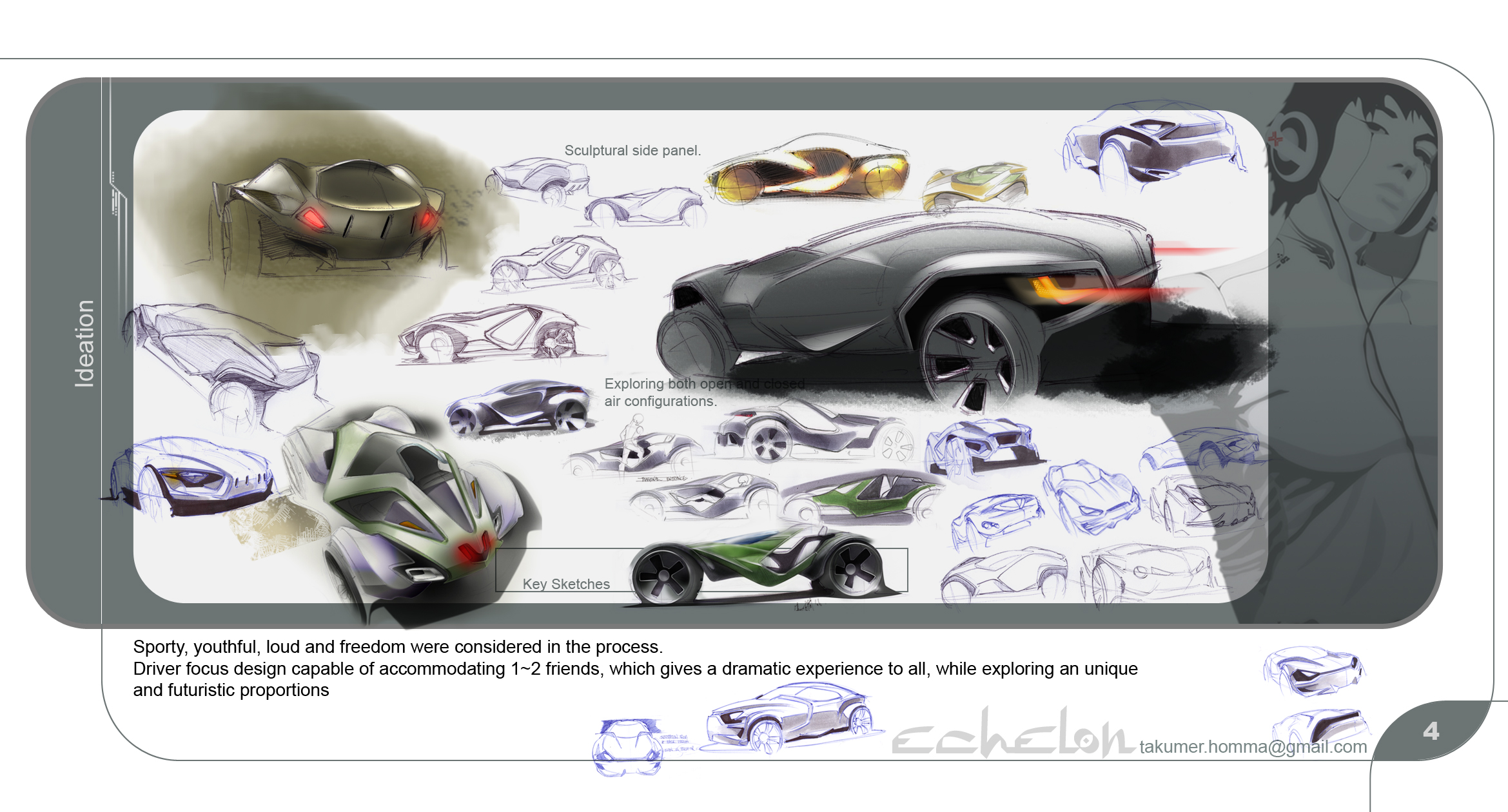
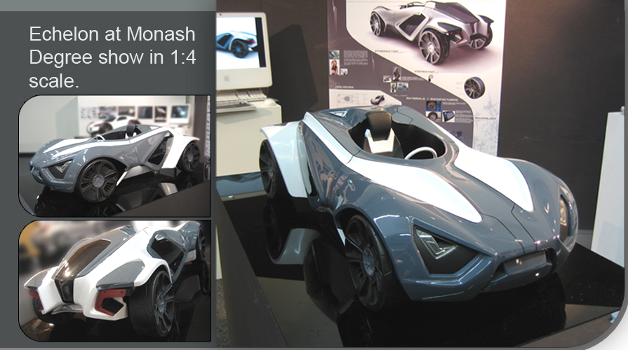
Sci-fi environment concepts
Journal Category
2D Concept art update
Journal Category

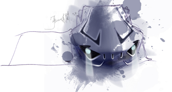

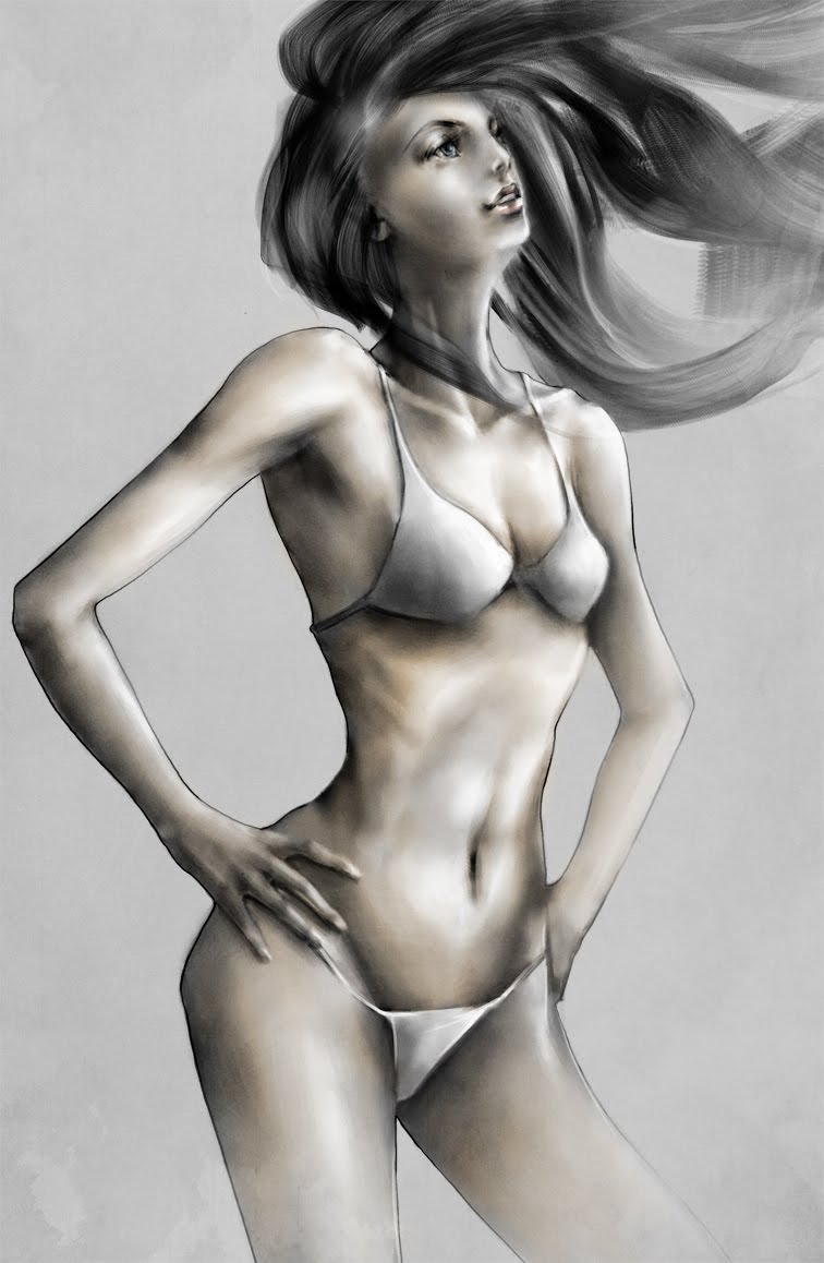
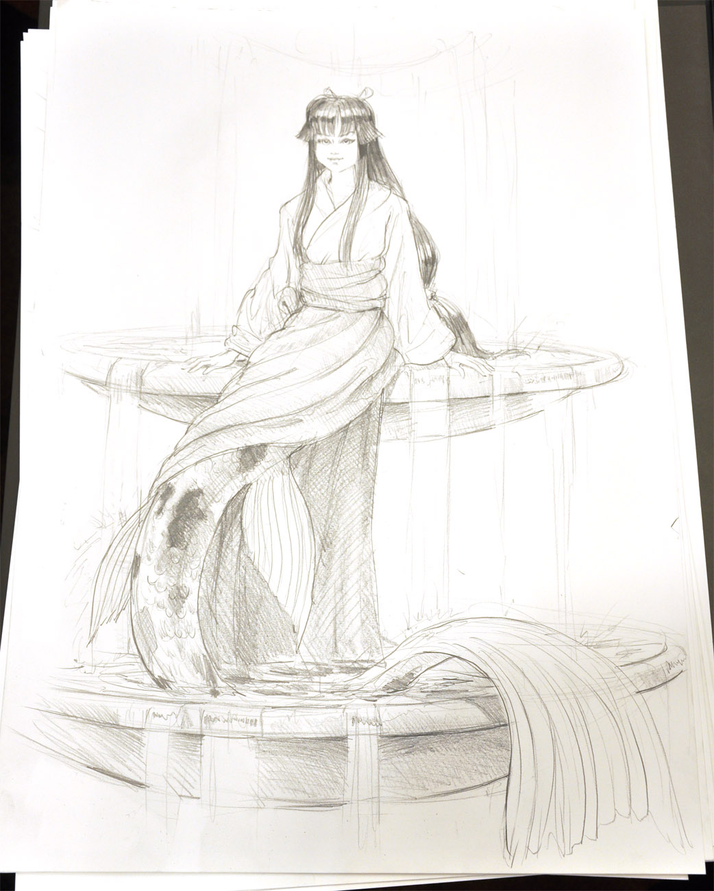
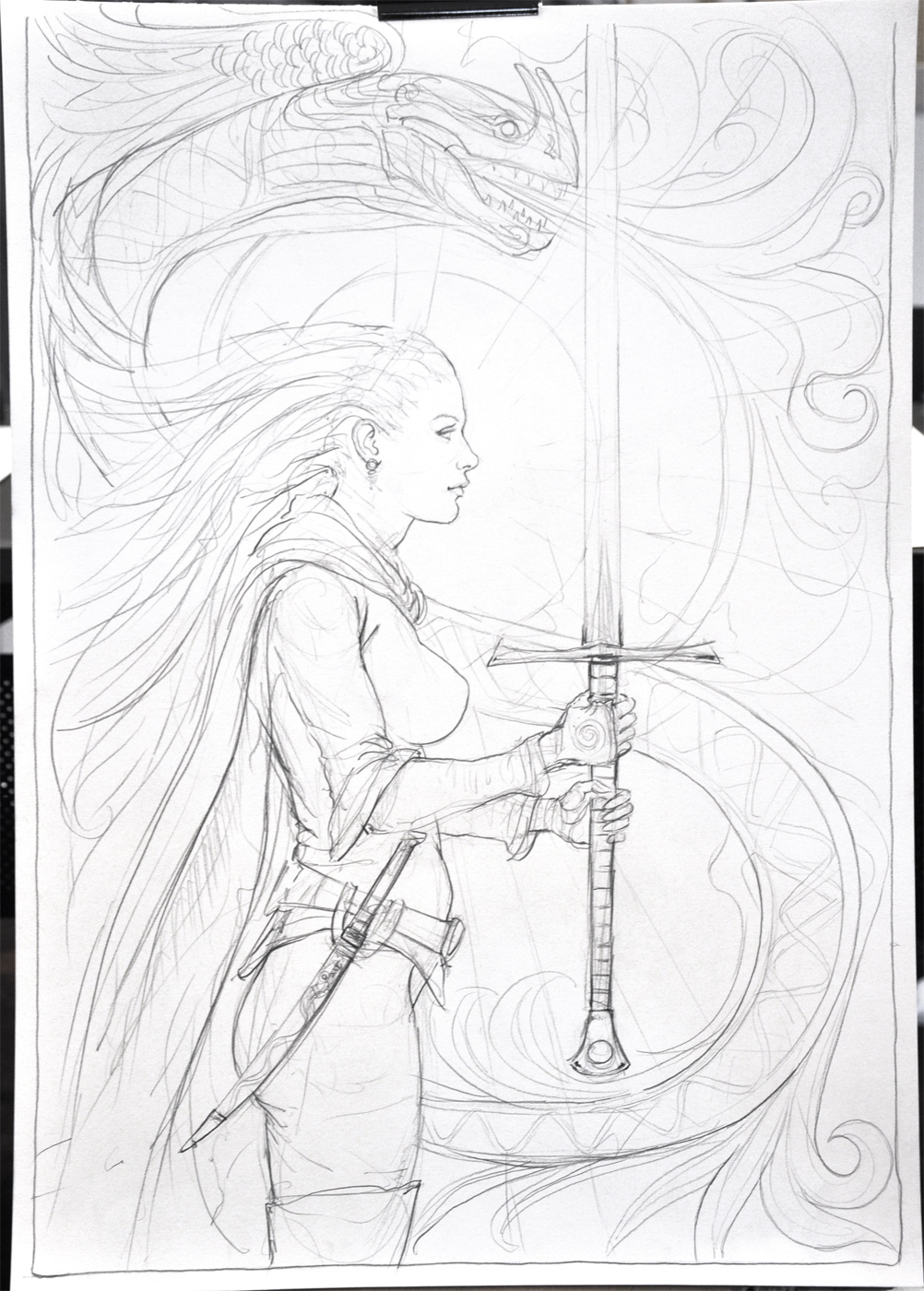
Pencil Stuff
Journal Category
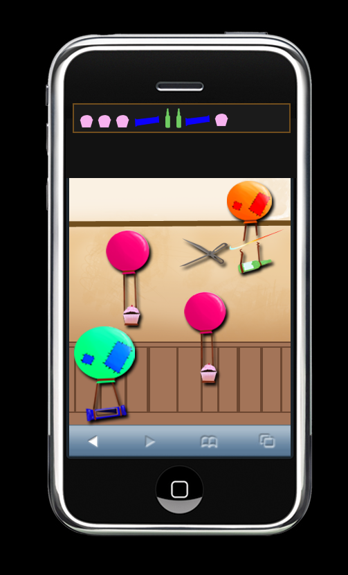
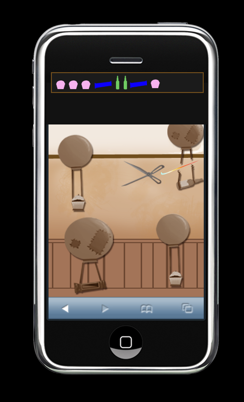
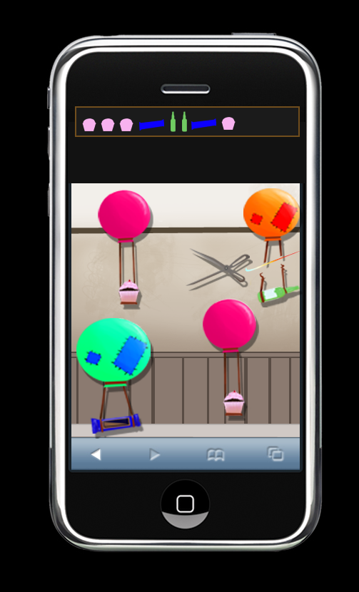
Tuginator iphone game graphics
Journal Category

Faux Comic Book Cover
Journal Category

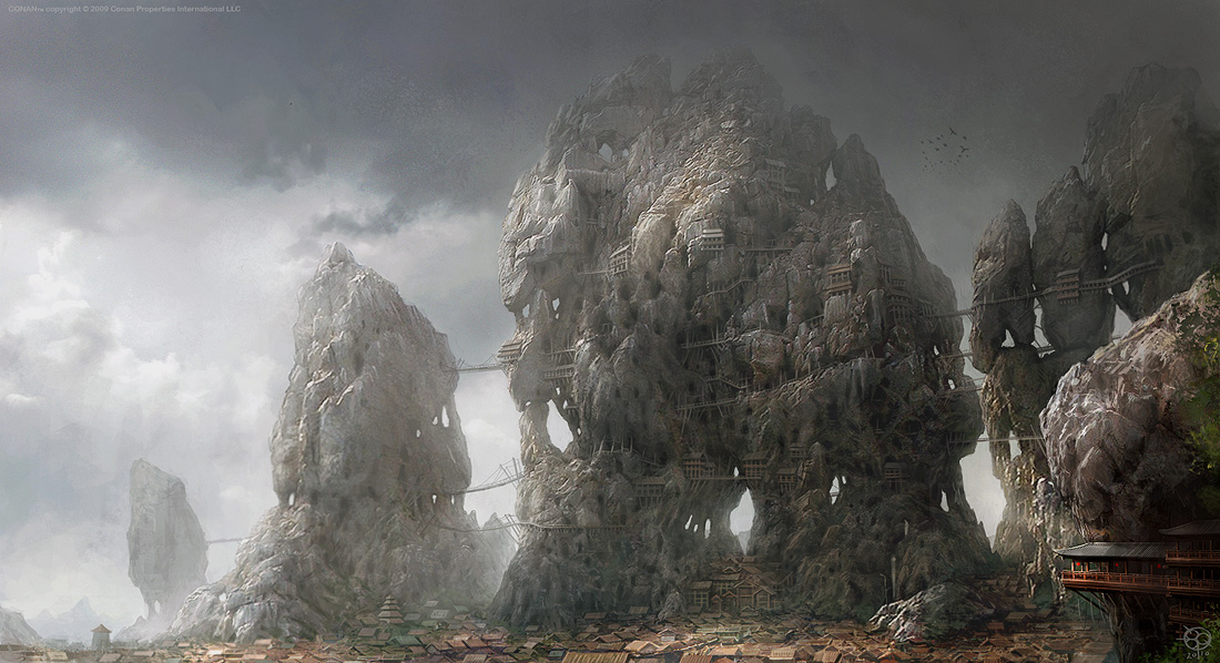
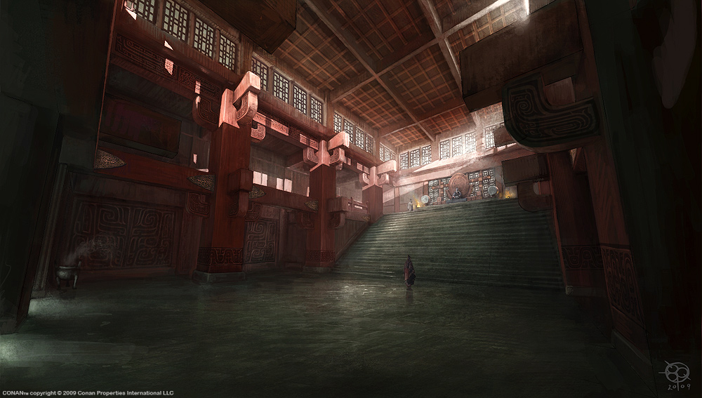
Yet more Rise of the Godslayer Art 05
Journal Category
Yet more Rise of the Godslayer Art 04
Journal Category
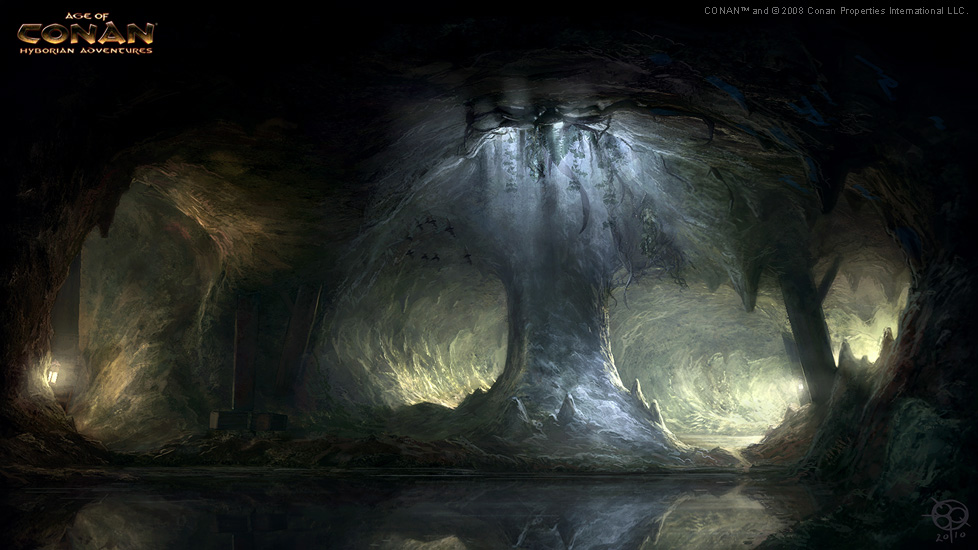
Yet more Rise of the Godslayer Art 03
Journal Category
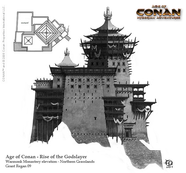
Yet more Rise of the Godslayer Art 02
Journal Category
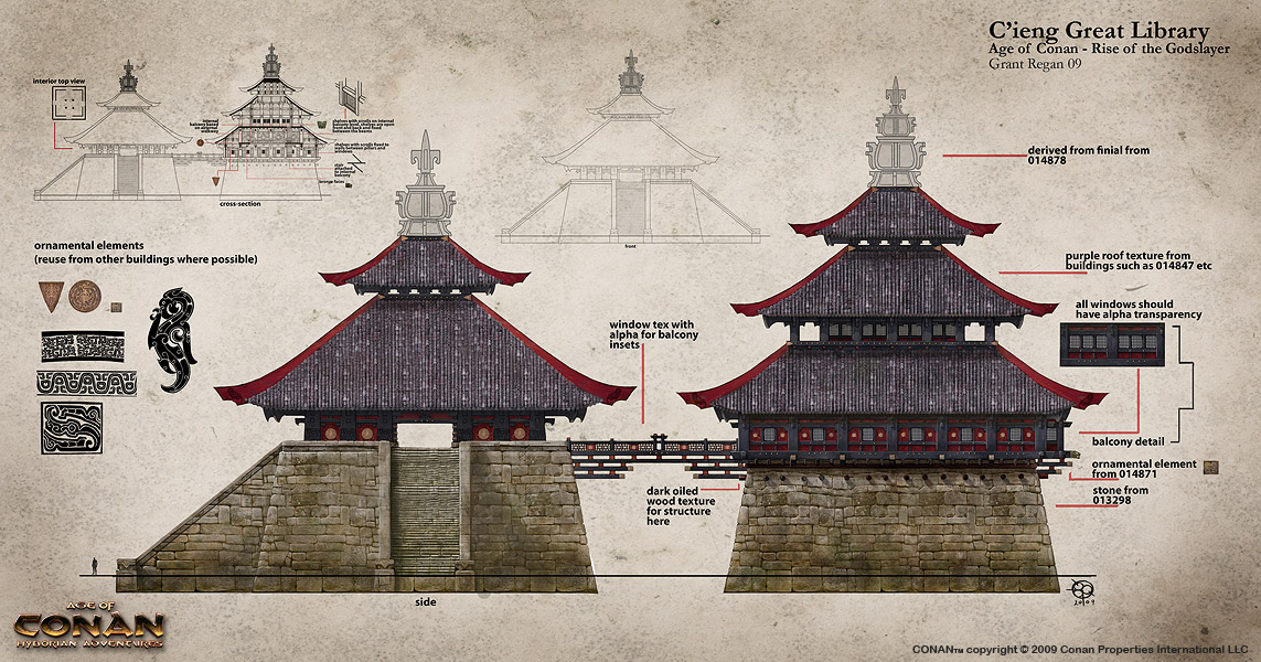
More Rise of the Godslayer Art 01
Journal Category