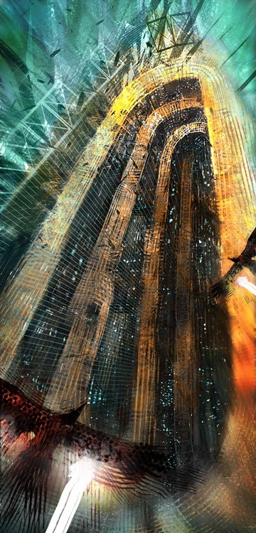
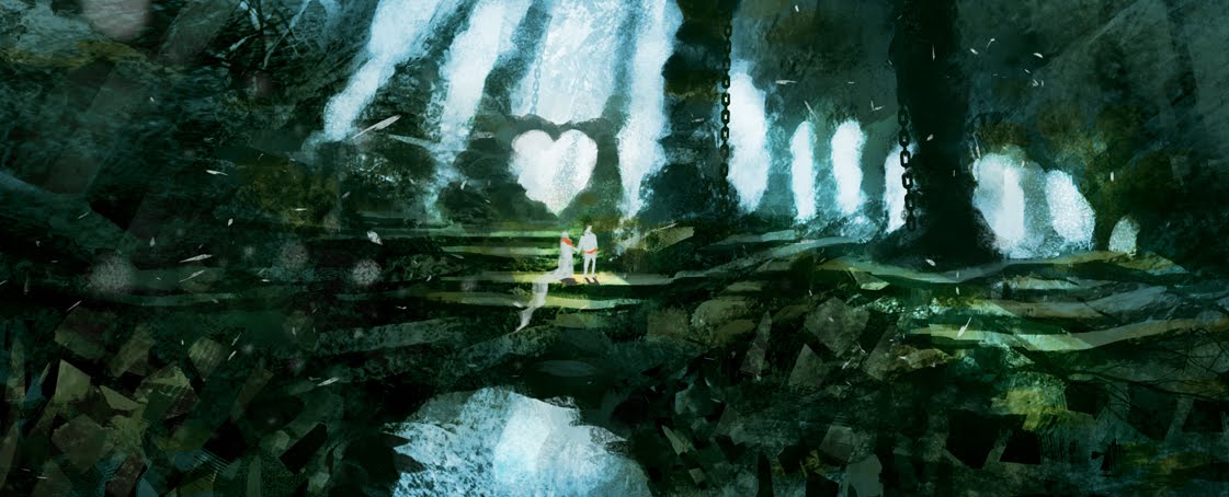
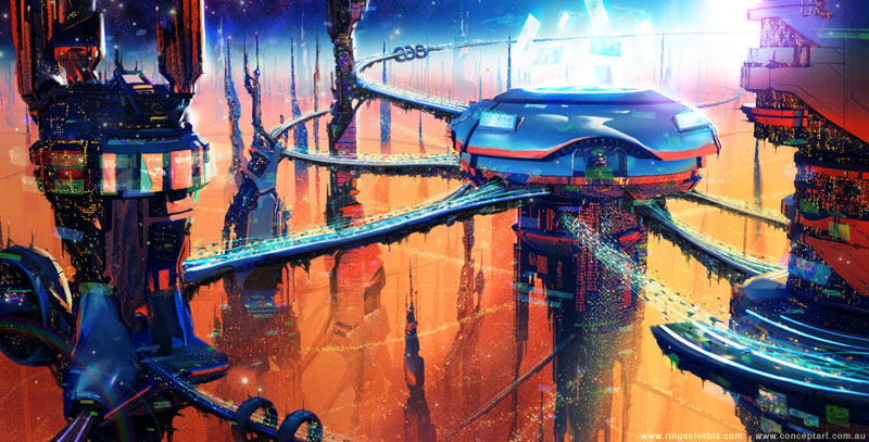
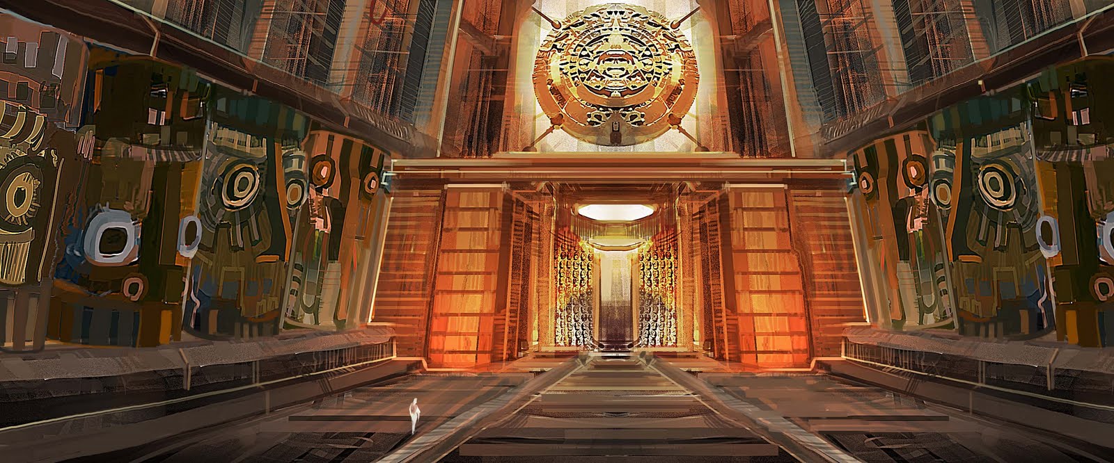
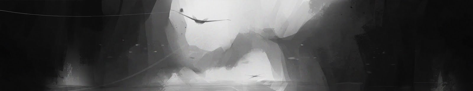
i quite like sky_city, wedding, B_01 and 22_02_2011
the spacial representation and elegant expression of movement of sky_city, teh creativity of language of wedding (waterfalls? white fountain jets? with falling leaves sureal moss covered architecture)
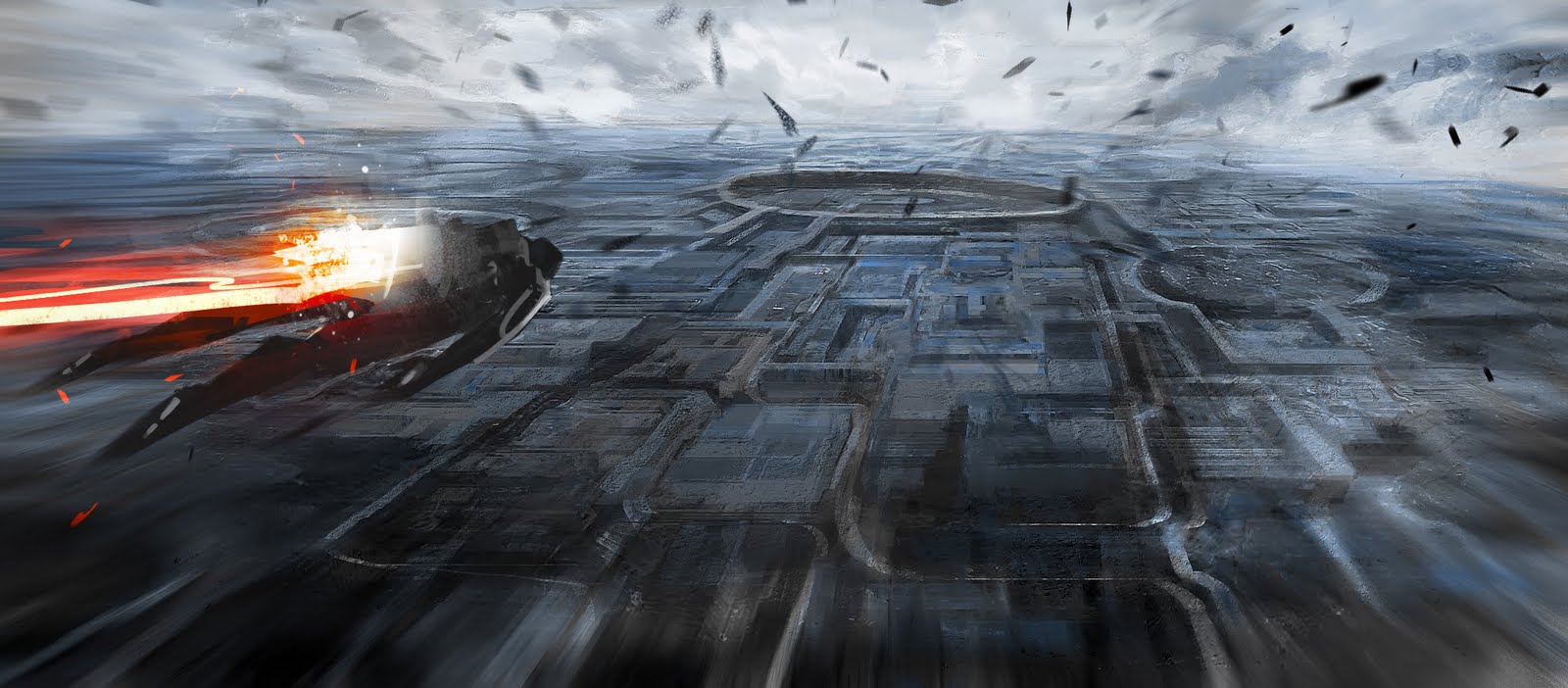
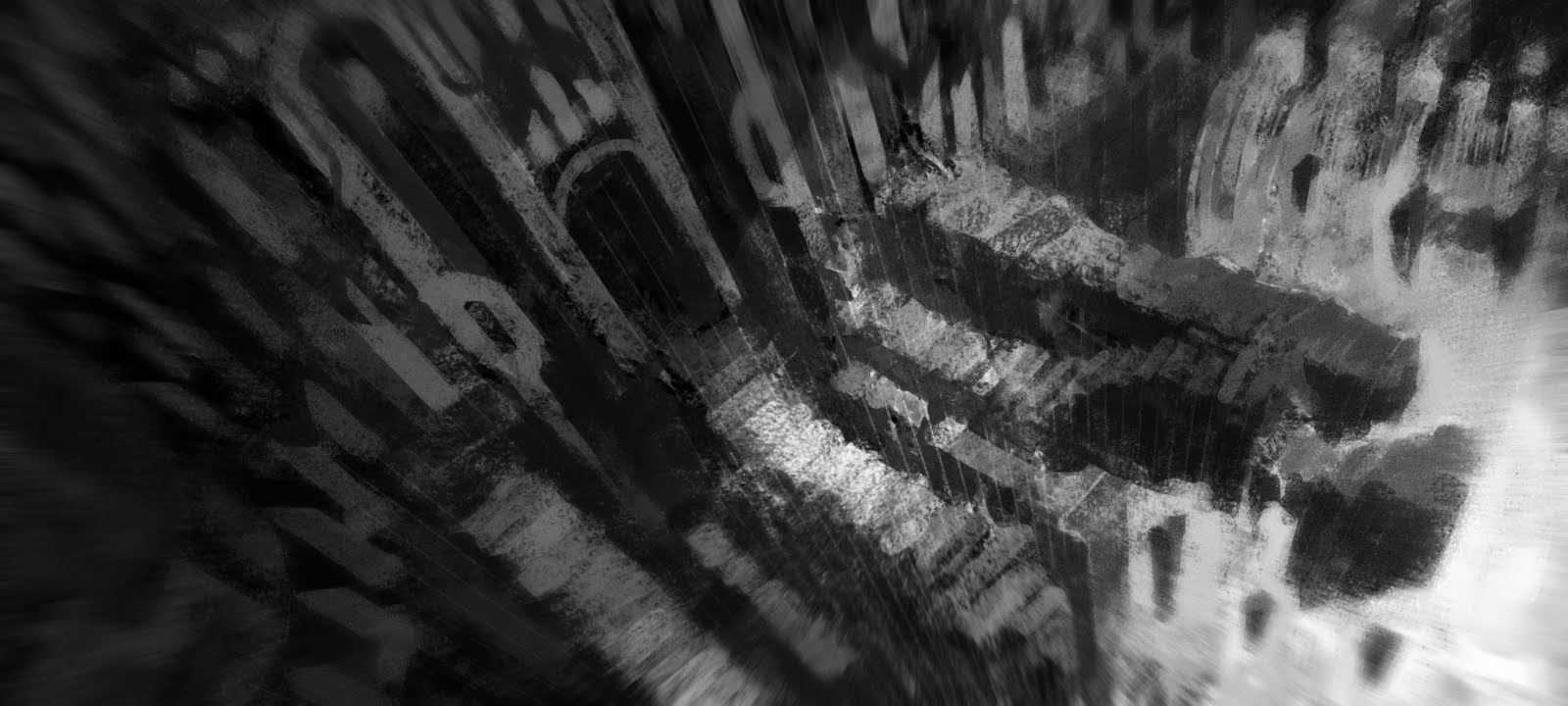
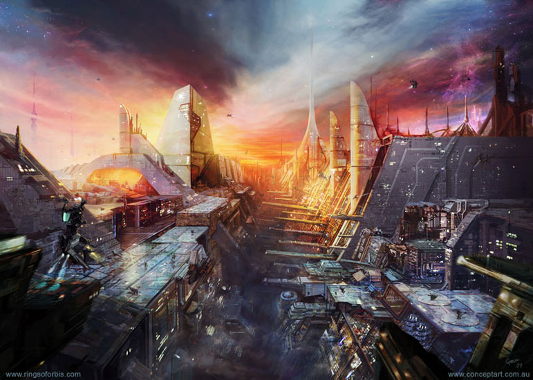
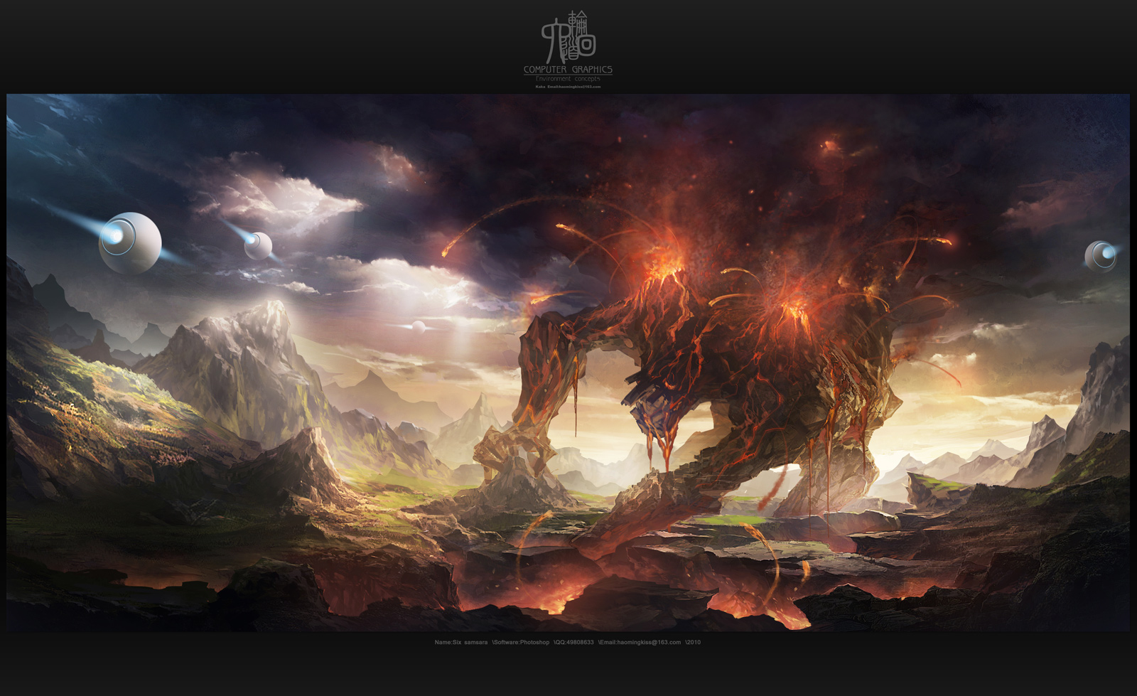
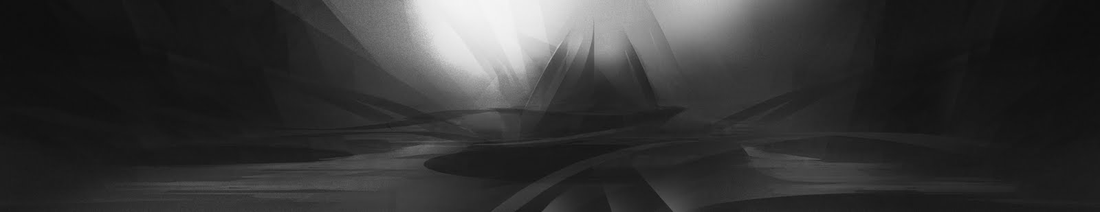
bit confused by underworld, though the confustion may be the point, looking down into the depths of the earth eaten away by silly scale construction.
good stuff
wow, quite simply that is incredible. composition, detail, technique and creativity.
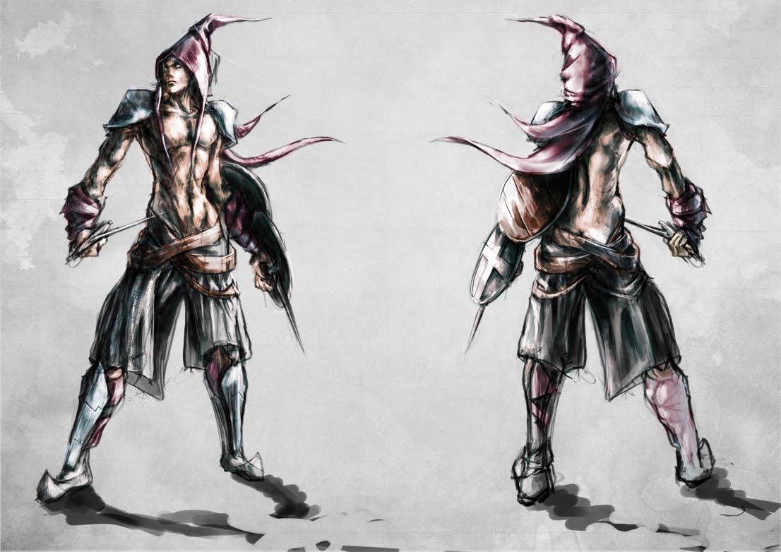
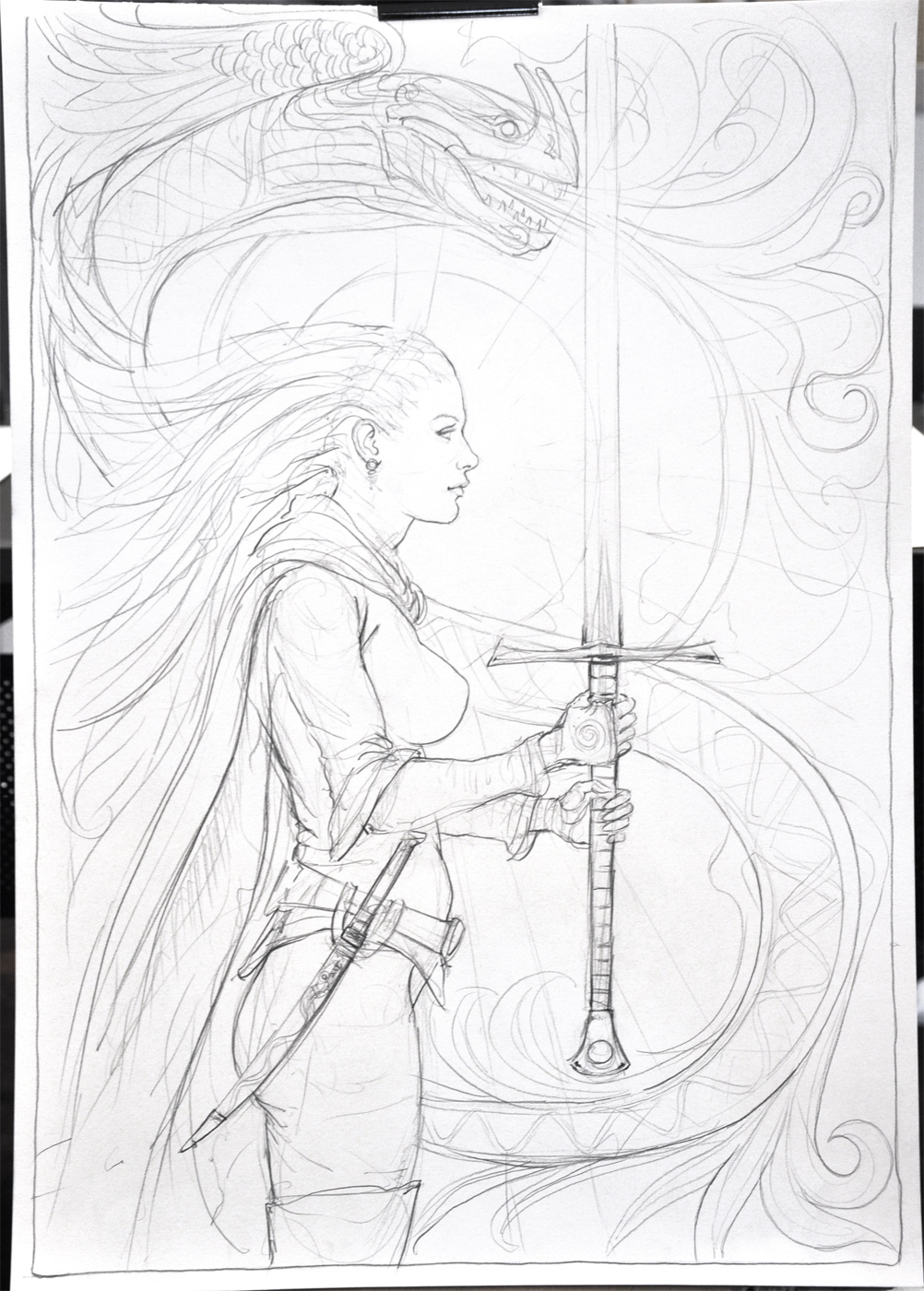
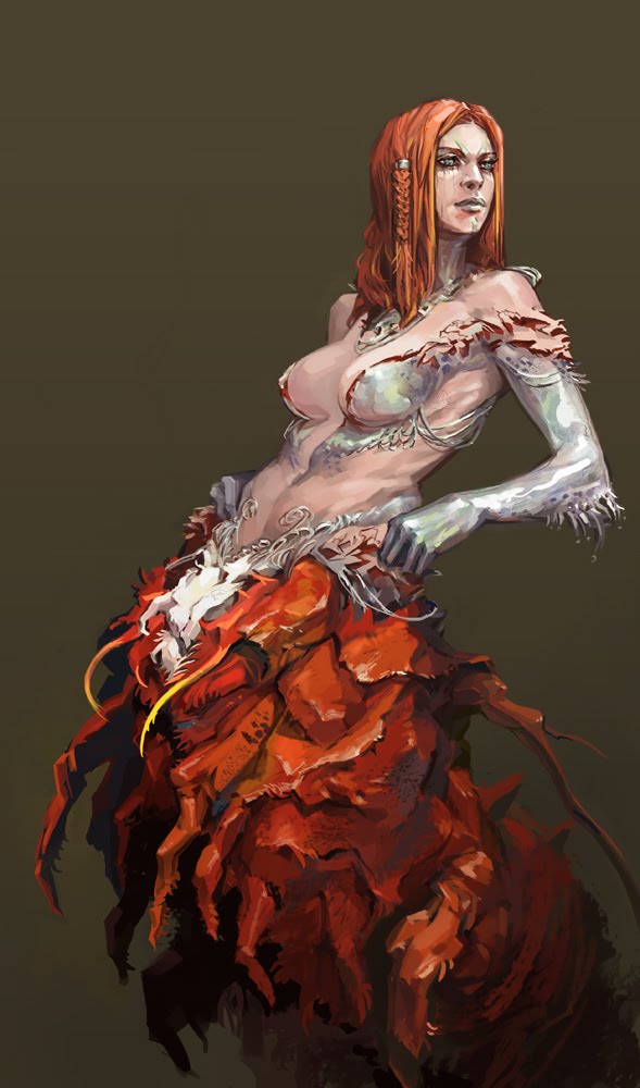
you seem strangely limited by correct human proportion, i guess intentionally to maintain a strong link to realism, but occasionally armour/ costumes/ masks can break size convention and be quite a bit larger or smaller than they reallistically need to be, just thinking of african masks and the 'deserter', but you presumably have a much better idea of what you where trying to do than me looking at a few pictures for a few seconds can deduce.
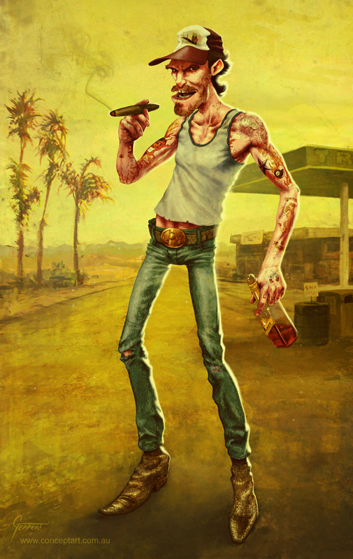
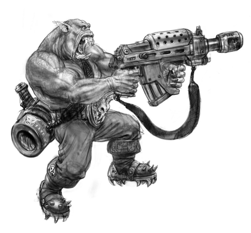
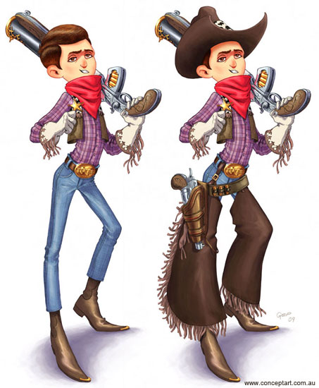
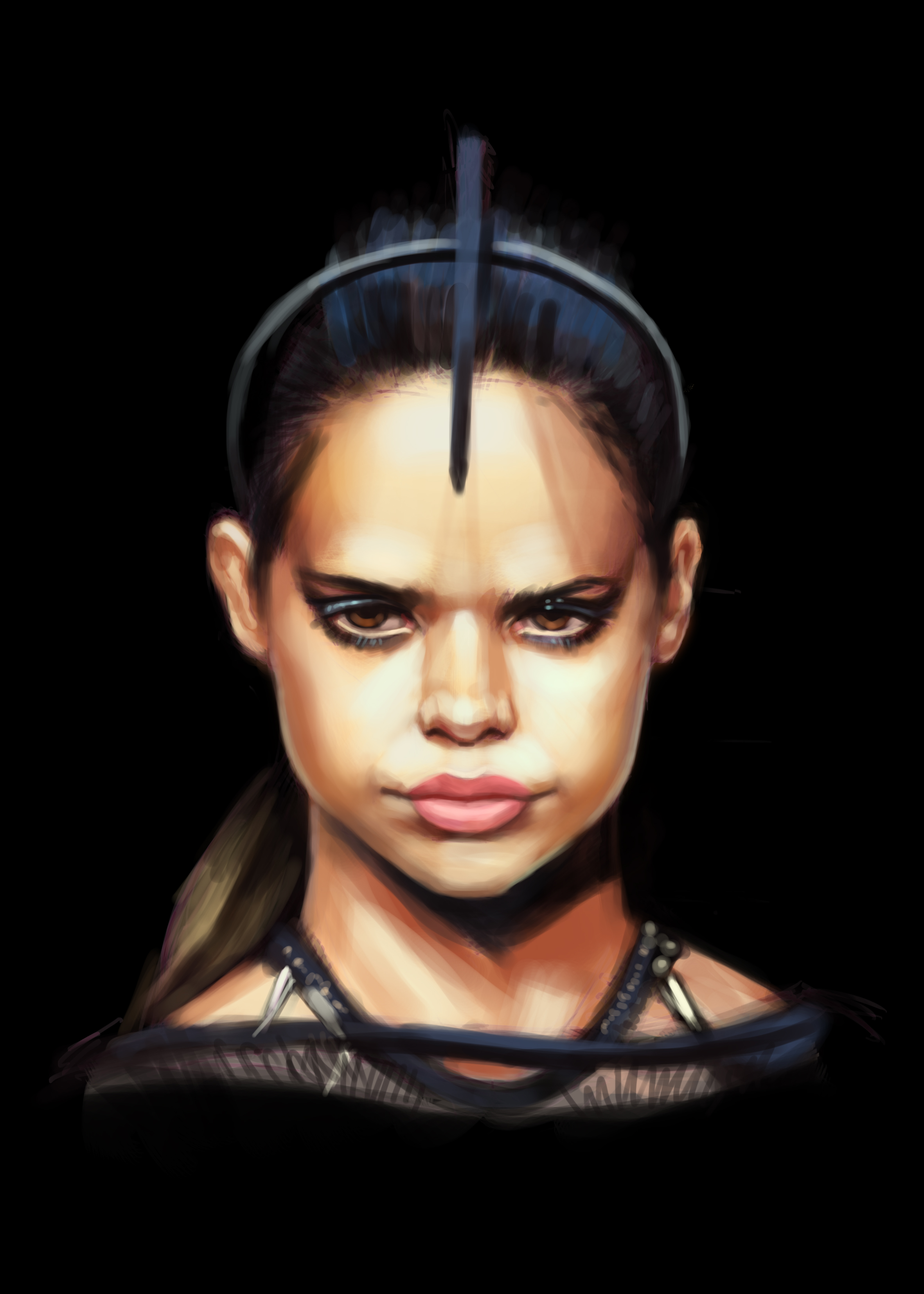
Hey guys, here is a couple of character designs. The truckie was done a while ago but I have given him a bit of an update and added a background. The sci-fi guy is all new.
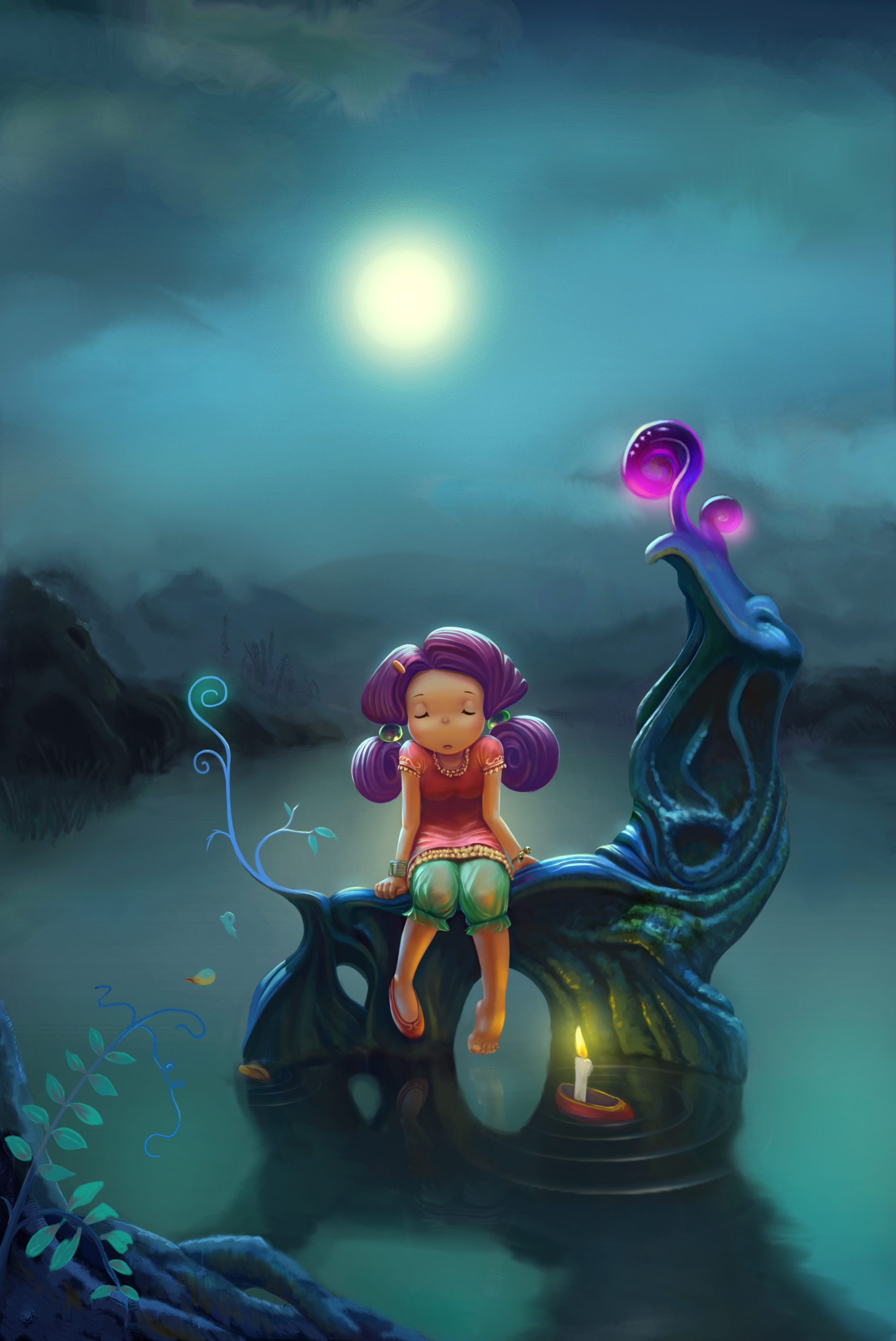
This is amazing! I have an interest in fantasy worlds that are very like 'alice in wonderland' kind. i really like the innocent cartoon overall look.
can you elaborate a little on your process and the tools you used.? great work keep it up!
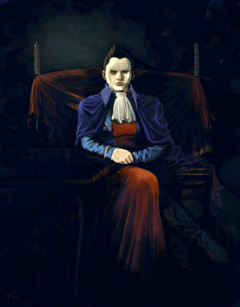
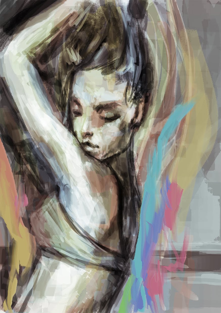
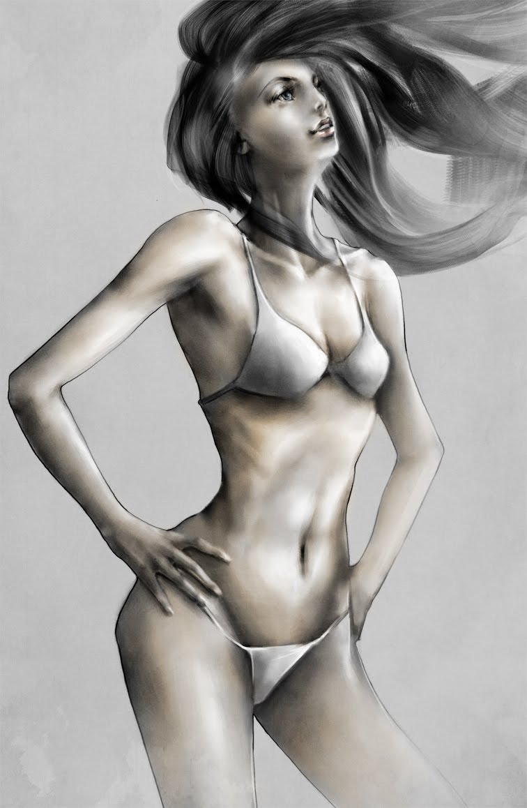
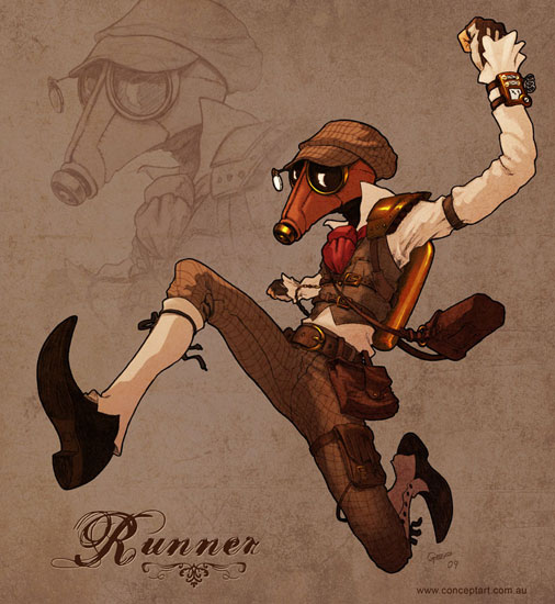
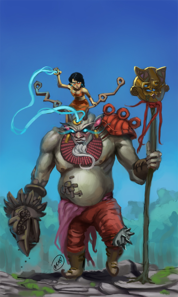
While not everything's really anatomically correct, and it doesn't appear this was your objective, your work captures a certain 'life' and emotion that's quite endearing. Keep it up.
you probably dont know how much it means to me to have someone appreciate and comment my work. I've been posting up my work in forums here and there for awhile now but i never really get any feedback. You are the first person to give me a good comment or any comment at that.
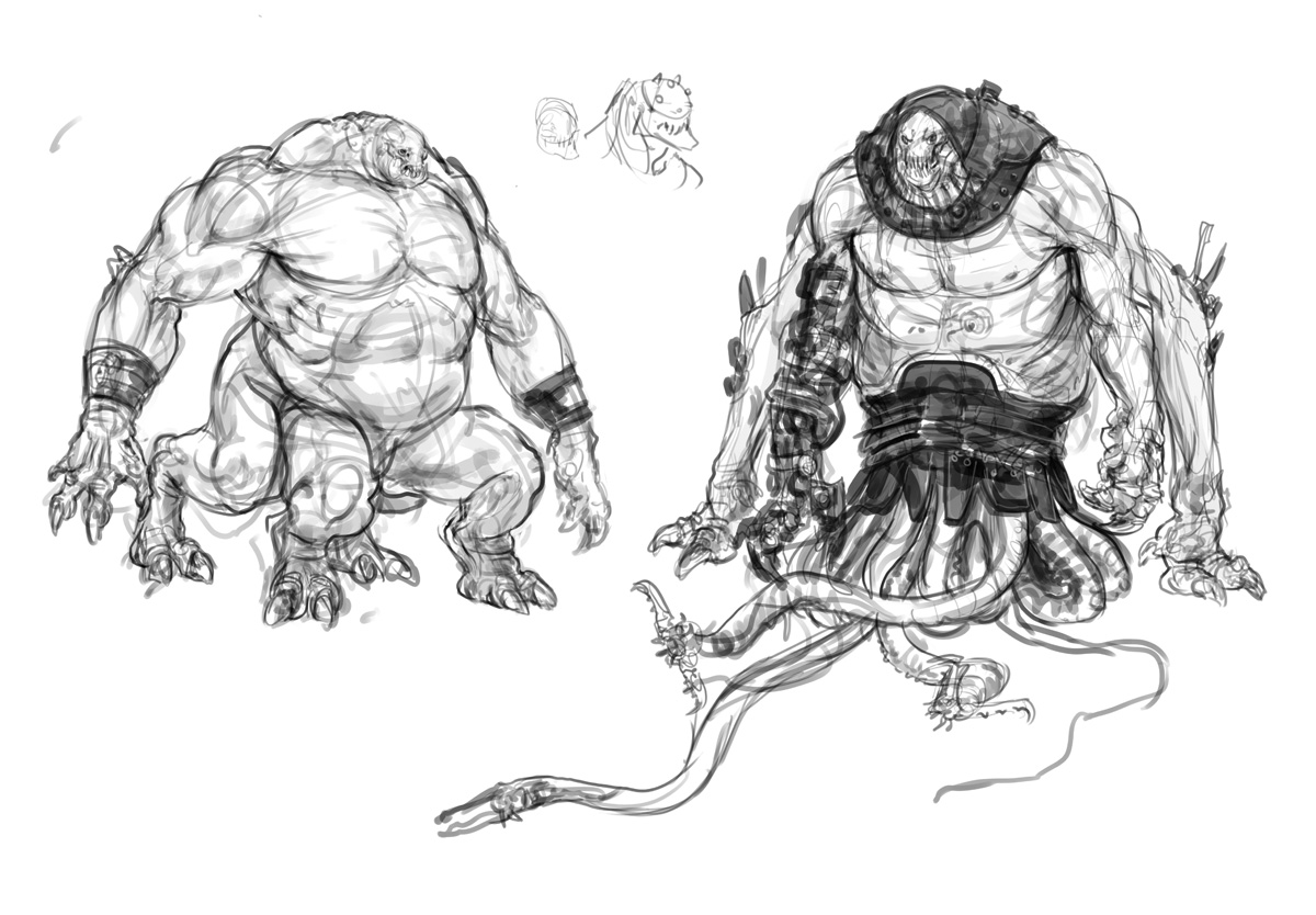
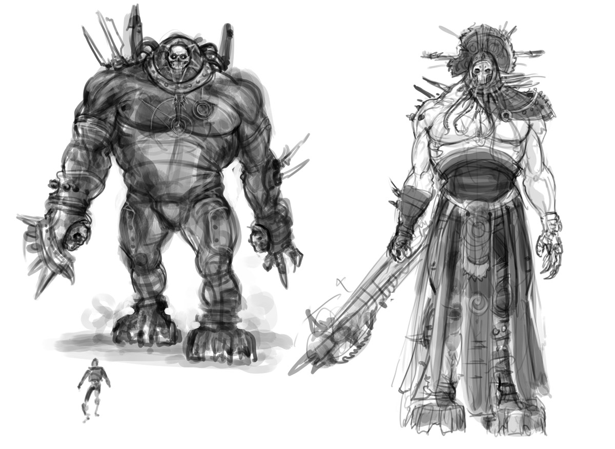
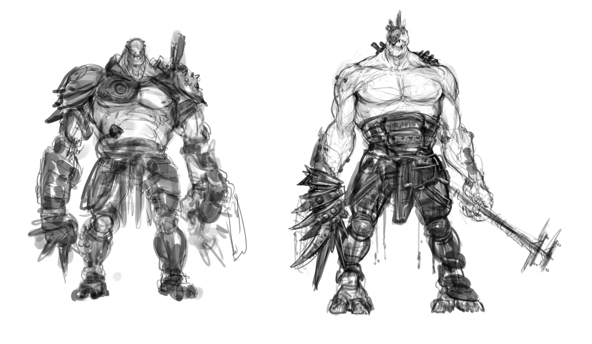
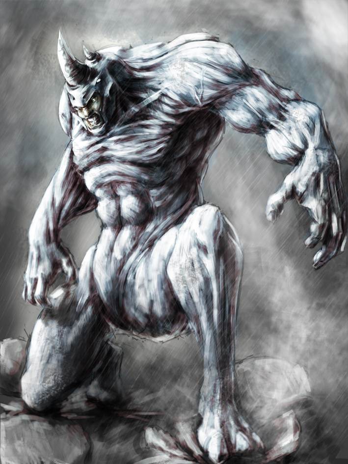
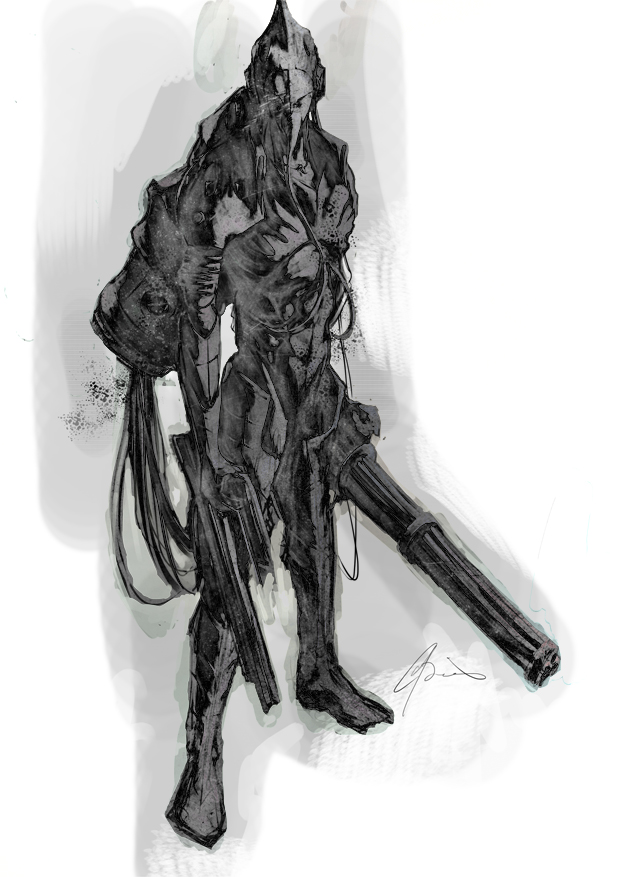
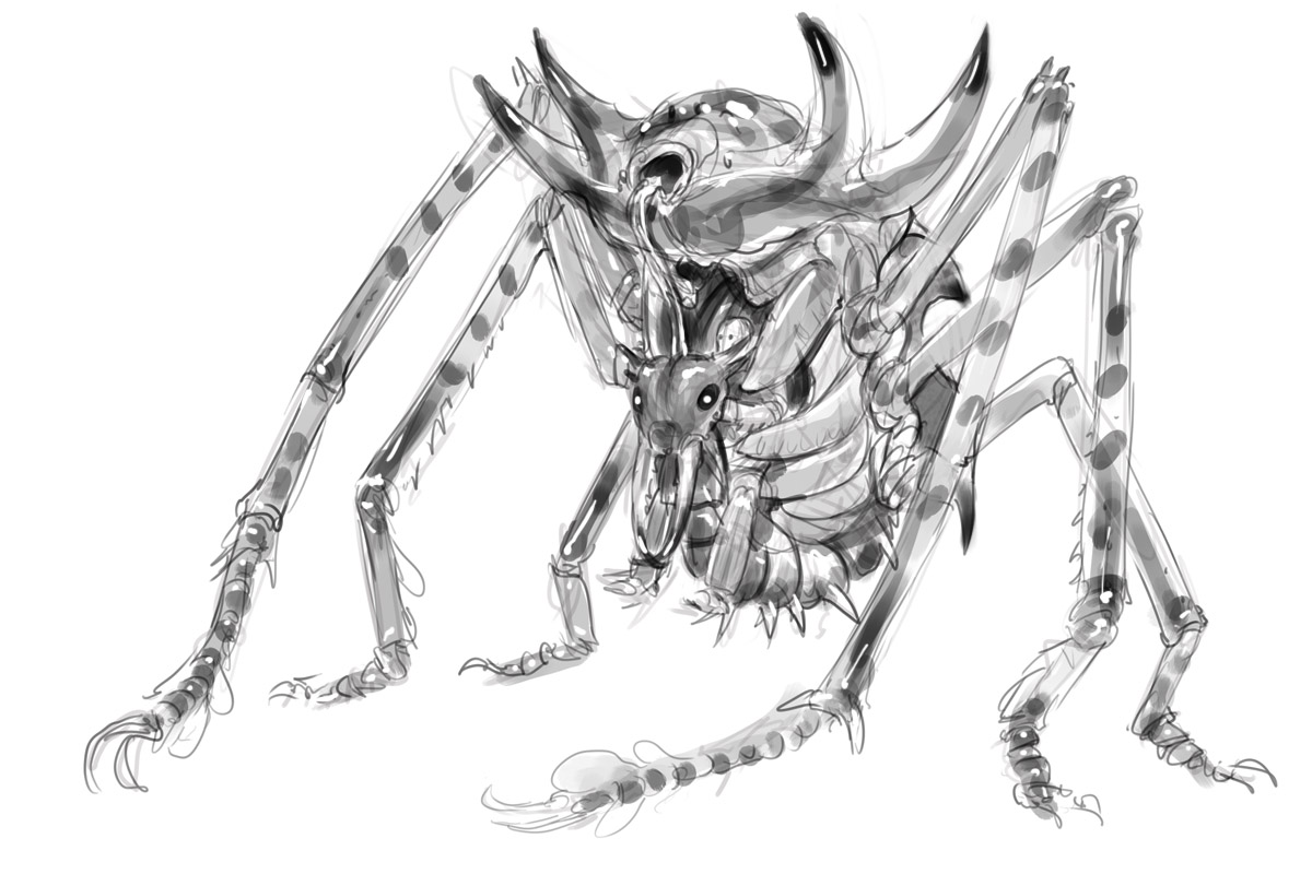
Dude, are you kidding. You stuff is excellent! I agree that some of the anatomy is not perfect on all you stuff, but your style does not require it. I really like the feel of your sketches, especially the Rhino and Minigun guy. Don't stop the music dude! ;)
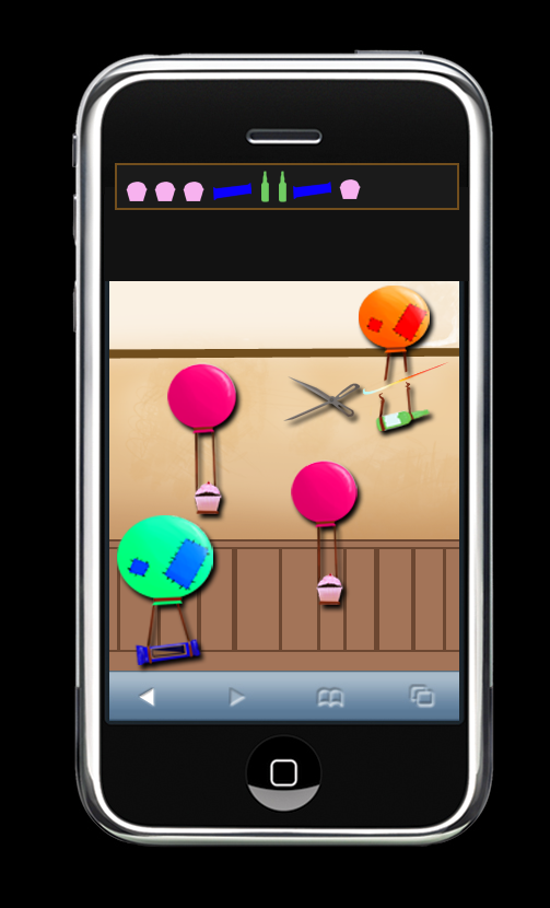
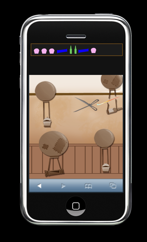
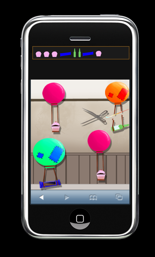
Three colour mock ups for a one day assessment. I realised after they were done that I had left the bottom of an I phone app on the screen. Rage ensued.
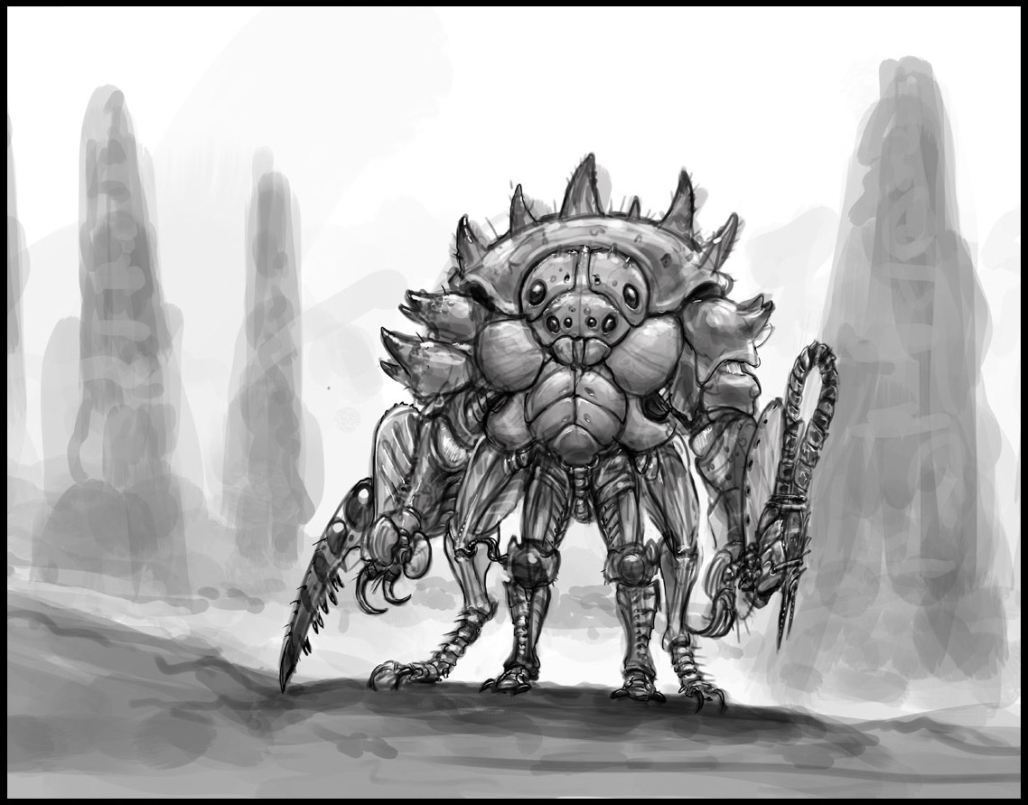
A recent and quickly done concept for a CHOW at conceptart.org -
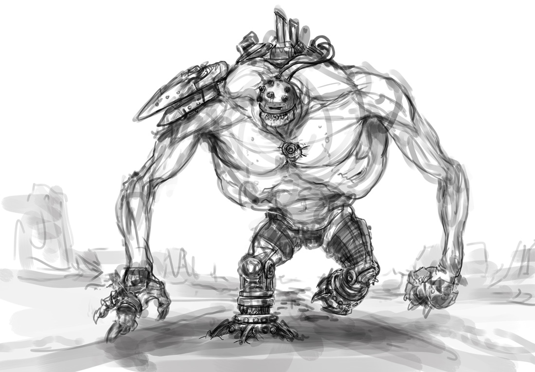
Insect Armour- cobbled together from giant alien insect/arthropod bits (the insect legs take the weight and mimic the movement of his legs - allow for power jumps etc.)
A recent and quickly done concept for a CHOW at conceptart.org -
Insect Armour- cobbled together from giant alien insect/arthropod bits (the insect legs take the weight and mimic the movement of his legs - allow for power jumps etc.)
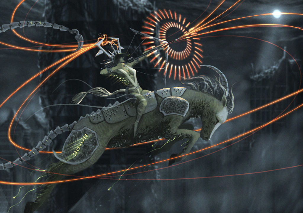
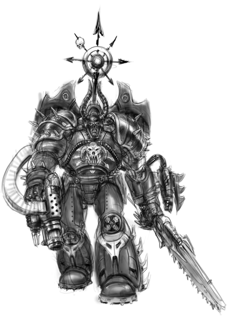
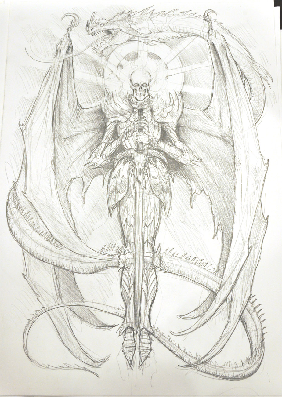
Here are a few images I've done I had printed, which I was selling at Aussiecon4. (And still selling if anyone's interested...)
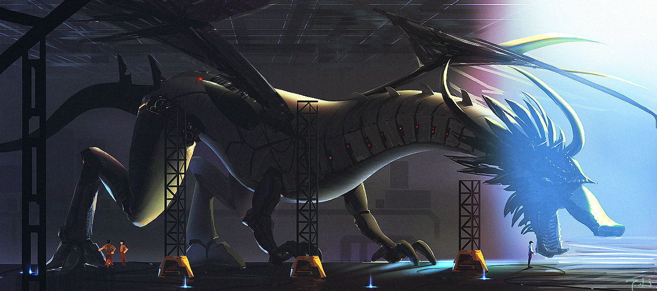
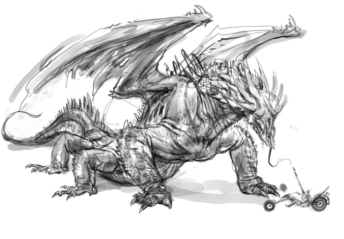
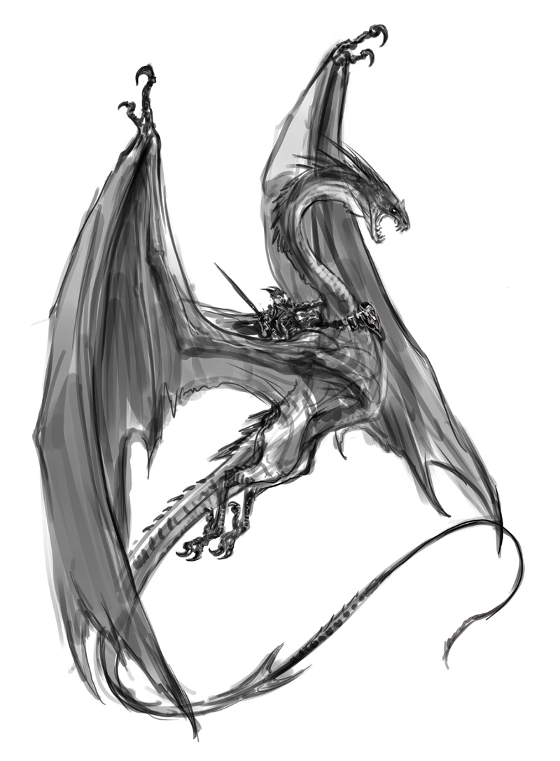
The dragon is rough and sketchy- but I like it the way it is.
I just had a quick check and it seems to be showing all fine. We've got some stringent caching mechanisms on the site so new pics and posts show up after the cache has expired (usually a short while after they're uploaded / written).
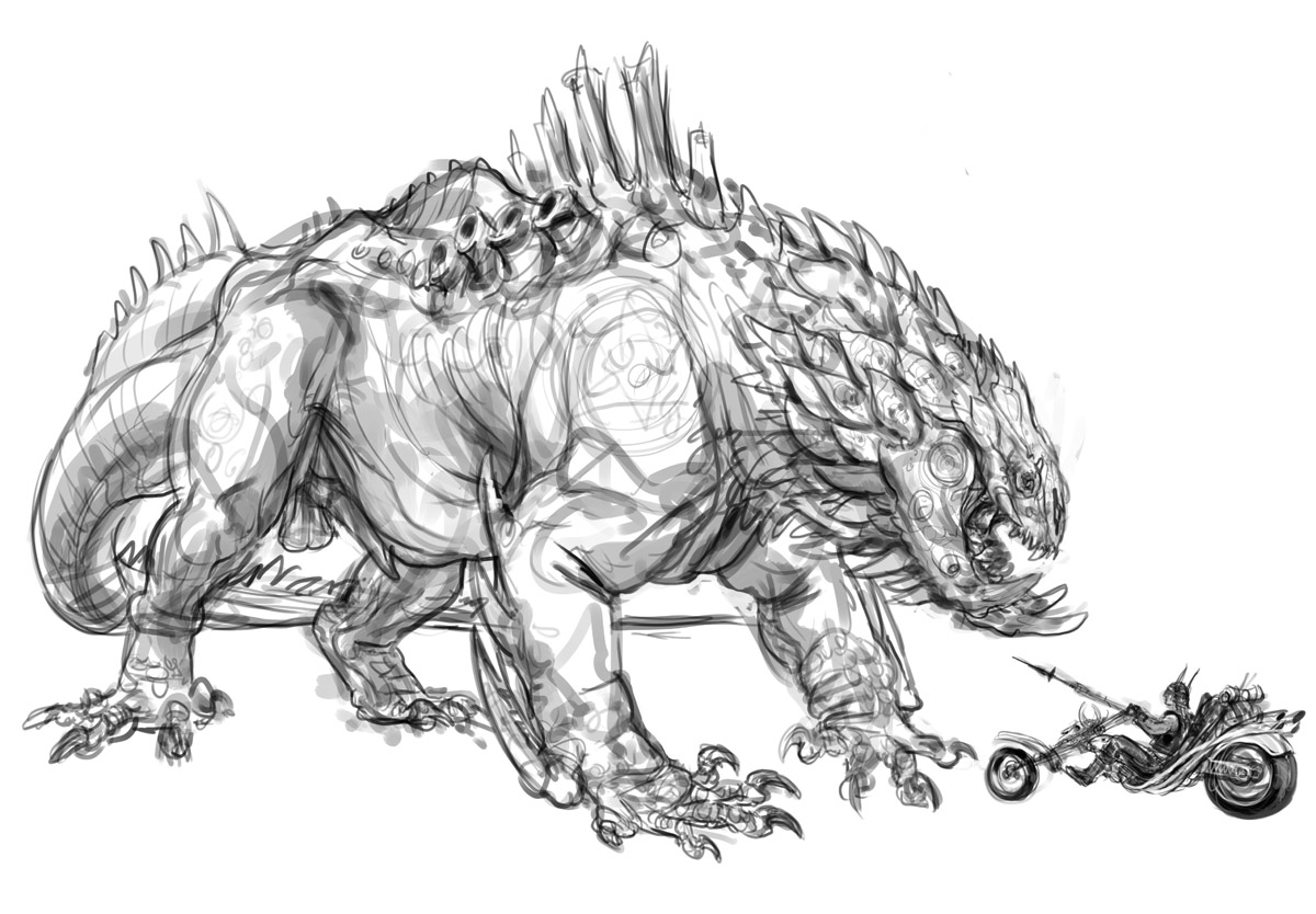
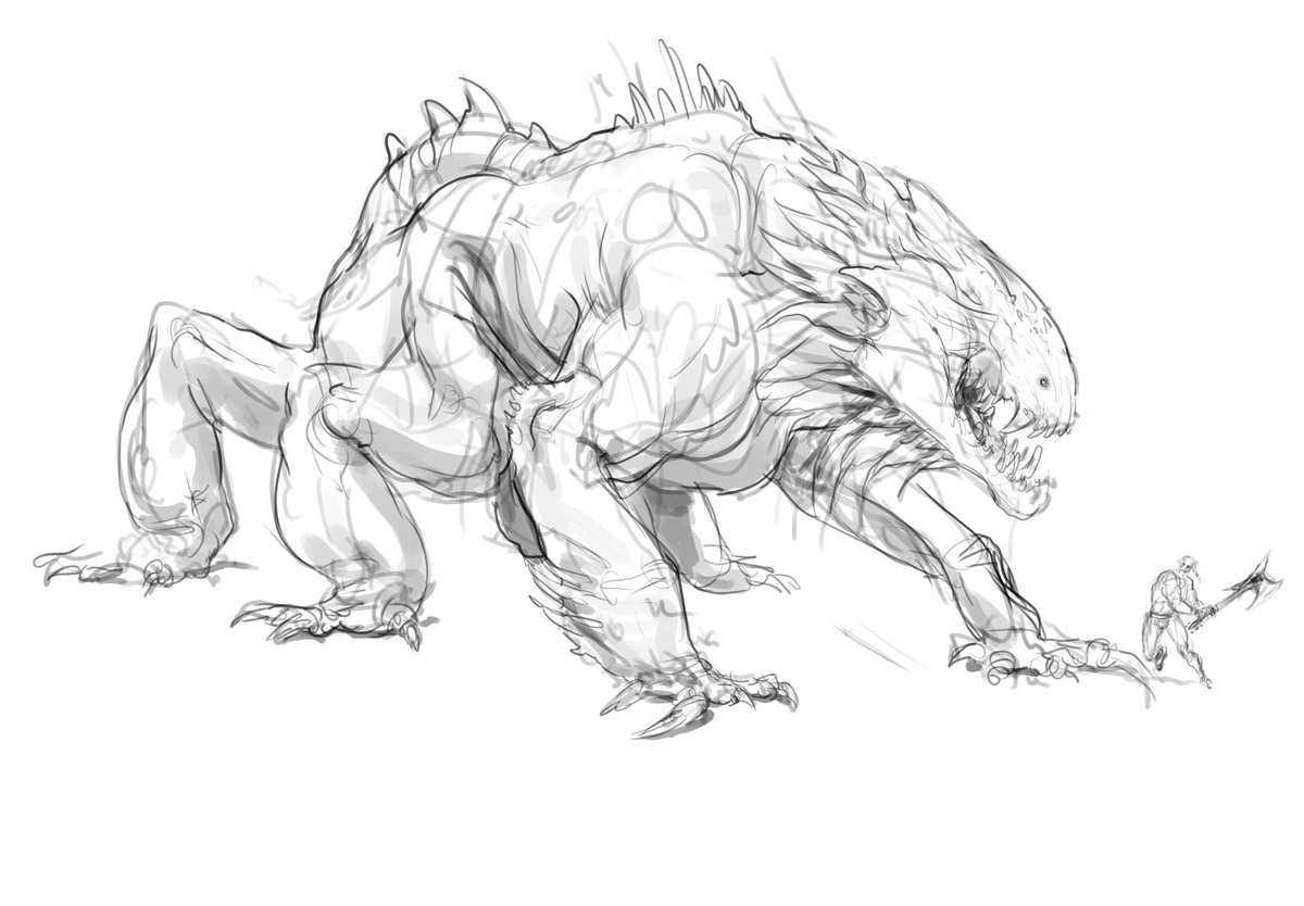
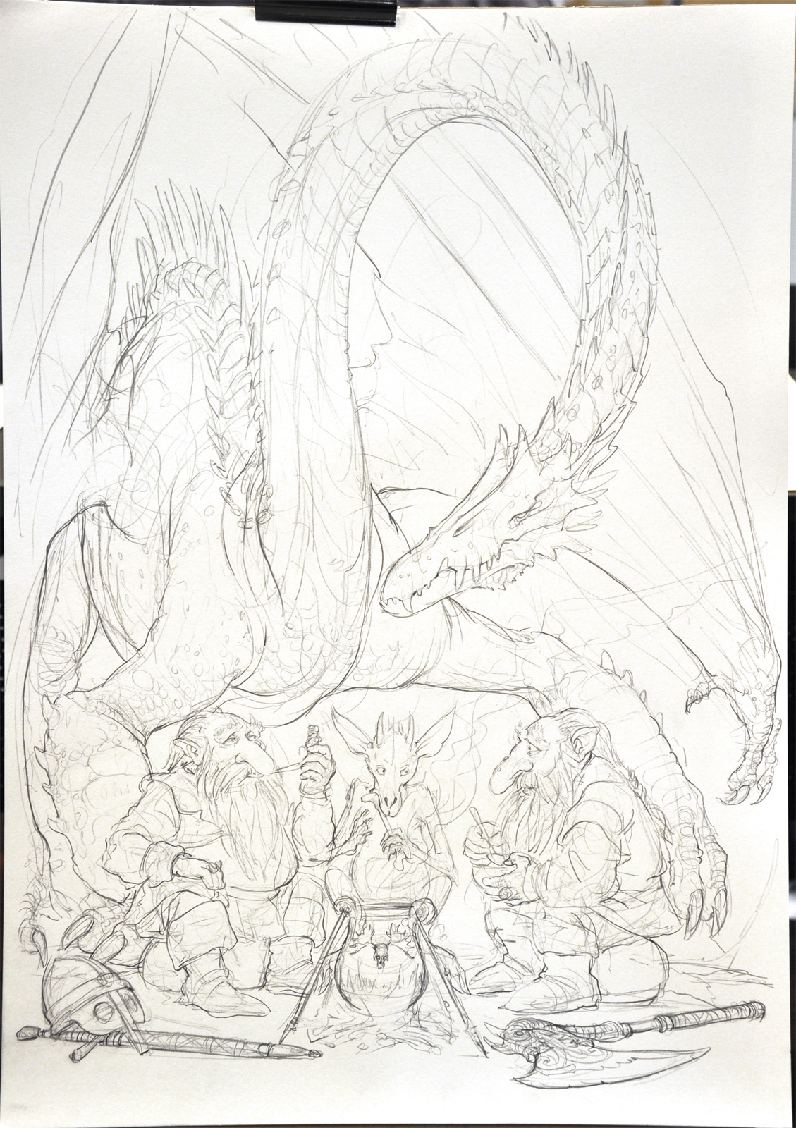
I was at Aussiecon4 in Melbourne a couple of weeks back and here are a few of the A2 drawings I did at my table. Normally
I'd draw bigger at these things but I didn't have time to get a big roll of paper- jut had the A2 pad.
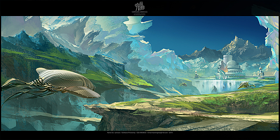
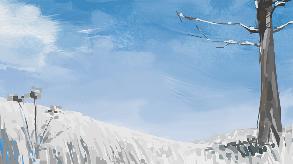
the level of visual accuracy without the limitations of photographic medium are a bit strange, amost expect to see some of the earths curvature at the enges of the horizon or other pespective distortion from a wide angle city shot, but that not the purpose, so great looking city scapes work well
Thanks David, I might try and put some horizon curvature or perspective distortion in to some future wide shots. I think it would be a good visual indicator to push the idea of the massive scale of some of these cities.
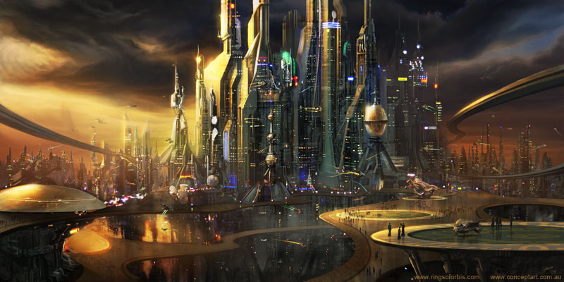
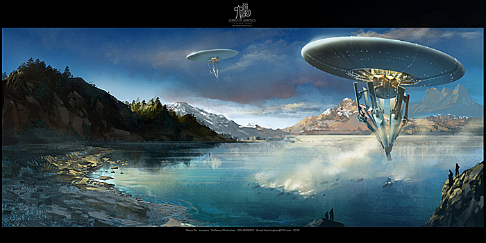
They're nice, but, they're more appropriate as environment concepts for a sci-fi flick, not, game. For a game, they're too ambitious; even with newer technology, the limitations in place would mean that the game environments would look nothing like those.
It's not a bad thing if you aren't that fussed about working in the game industry, but, since this is a game developer centric site...


i quite like sky_city,
i quite like sky_city, wedding, B_01 and 22_02_2011
the spacial representation and elegant expression of movement of sky_city, teh creativity of language of wedding (waterfalls? white fountain jets? with falling leaves sureal moss covered architecture)
bit confused by underworld, though the confustion may be the point, looking down into the depths of the earth eaten away by silly scale construction.
good stuff